Tag: bridget riley

Bridget Riley’s “Fragment 2” at Phoenix Art Museum

November 17th, 2010 | No Comments

I’ve been on a bit of a Bridget Riley kick lately. This happens every now and then. Something will start me thinking about Riley’s groundbreaking early op art work — how it completely dismantled the status quo in the early 60s — and how her work has steadily evolved over time. And so, I’ll check out books about Riley and read like a fiend, drawing inspiration with every turn of the page.

My most recent bout with Rileymania was sparked by my encounter with Fragment 2/10, part of Phoenix Art Museum’s permanent collection, shown below. (Yet another very good reason to visit Phoenix Art Museum!)


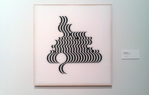
Bridget Riley’s Fragment 2/10, 1965, screenprint on Perspex.


In England, Riley’s work is back in focus in a big way. Next week (beginning November 24 and continuing through May 22, 2011), the National Gallery will showcase her newest paintings in Bridget Riley: Paintings and Related Work. For the past year, Bridget Riley: Flashback, a retrospective, has been touring England; the exhibition is on view at Southampton City Art Gallery through December 5. Her early fragment series showed at Karsten Schubert in London over the summer.

Likewise, a wealth of interviews with Riley are available online, thanks to BBC radio. A new Radio 4 production, Shimmer and Dazzle, Seeing What Bridget Riley Sees, previews the National Gallery exhibition (audio is online through November 23). Riley’s recollections in that piece overlap this interview with John Tusa. You can also catch these excerpts from a 1988 interview with Julian Spalding.

While I appreciate Riley’s work on many levels, I respect her art historical sensibility and uncompromising commitment to making work her own way. When early fame had unfortunate consequences, Riley regrouped and found a means to enable her work to evolve dynamically over time.


Line vs. color: Reconciling early Bridget Riley and Verner Panton

February 7th, 2009 | 4 Comments

To be honest, when considering the massive polarity between line and color found throughout art history—between the Poussinistes and Rubenistes, between Ingres and Courbet—I’ve never taken sides. Perhaps it’s because I’ve never taken a life drawing class (and I have no wish to do so), and my early interest in packaging design. I always thought that a colorful stripe, slashing the pictorial plane, perfectly embodies both approaches. And when I first read about Ingres and Courbet’s vehemence for each other, I found their argument somewhat quaint.

Yet, my thinking has evolved considerably of late. For the first three weeks of January, I was immersed in two Verner Panton books: His Vitra Design Museum retrospective catalog and Lidt om Farver (Notes on Colour). The two books have changed how I approach color in my own work; Panton was completely daring in his use of colors, and he shunned white.

Since then, I’ve been reading about Bridget Riley, trying to gain more insight into her radical early Sixties op art paintings. I am completely fascinated by these pieces’ startling originality. They blow my mind—and seem to have been generated from nowhere. In 1959, Riley makes a copy of Seurat’s Le Pont de Courbevoie. Two years later, she paints Kiss, and then Blaze I in 1962. Riley’s works from 1961 – 1965 are all achromatic.

Thus, paring Panton’s turn-of-the-Seventies Visiona environments and Mira-X textiles with Riley’s work just a few years prior offers a plenty of grounds for comparison and contrast. Each is a master of an approach. They share is an art form that is purely optical and dangerously hypnotic. Perhaps most importantly, these works shun intellectual treatment. Dave Hickey’s assessment of Op Art (found in the Optic Nerve catalog) helps explain this: “Op does its own work for whoever will look. It dispenses with the repertoire of knowledge and experience that is presumed to be required to appreciate abstract art. It replaces the elite intellectual pleasure of ‘getting it’ with the egalitarian fun-house pleasures of disorientation, of trying to understand something you cannot … As we stand before Op paintings that resist our understanding, we introduce ourselves to our unconscious selves. We become aware of the vast intellectual and perceptual resources that await our command just beyond the threshold of our knowing.”

For as much as I appreciate Panton and Riley, their approaches are hard to reconcile. Panton was a master colorist, and he mined the optical power of subtle changes in hues, shades and values. But foremost, he was a designer, and he approached color from the perspective of function. “Using colours is like life,” he wrote in Notes on Color. “One must have a goal. The goal can be almost anything—also make the most awful colour combinations.” And he writes elsewhere, “Choosing colours should not be a gamble. It should be a conscious decision. Colours have a meaning and function.”

Verner Pantons Onion pattern

Verner Panton’s Onion 2 textile

Quite the opposite, Riley admitted to struggling with color early in her career. Her early paintings aimed for maximum contrast, which is why she chose black gouache on white paper (or white over black ink on plexiglass for her silkscreens). In the early 1960s, Riley chooses to produce work that is “beautifully aggressive.” As she explains in Dialogues on Art, a series of interviews with the artist, “Contrast is the clash of cymbals, the exclamation mark, the strongest possible means. That I wanted; I felt very much at the time like making an extreme statement, of something violent, something that definitely did disturb.” A complete assault on the optic nerve!

Bridget Riley’s 1965 painting Arrest

I’m charging myself with reconciling the aesthetic principles of Panton and early Riley. That’s where my mind is at right now. I want to produce work that perfectly balances line and color. I want to make works that dazzle the optic nerve, transporting the viewer into the fourth dimension. And if I am working with pattern, I will also be employing a sense of intrinsic structure and compositional order.