Tag: painting techniques

Time management and art

January 15th, 2014 | 5 Comments

Five lessons I have learned from having a goal of painting 1,500 hours in 2014

As we entered 2014, I found that I had created a New Year’s resolution for myself.

The resolution was more of a personal goal — what Jim Collins might call a “big, hairy audacious goal.”

I knew that I wanted to give my all to painting in the forthcoming year. I also knew that giving my all takes time — a commitment of time. The idea of painting (and sketching) for six hours per day popped into my mind. That’s 30 hours per week.

time management and art
Stopwatch running. (Game show announcer voice: Wristwear generously provided by George W. Stone.)


Extrapolating this figure over the course of a year, I realized I was staring at a goal of 1,500 hours of painting and sketching in 2014.

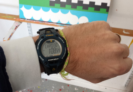
So there I was in my studio on January 2, with an Ironman stopwatch strapped to my wrist, pressing the start button when I got to work, pressing the stop button when I stepped away from the easel, and logging my progress into a worksheet, seeing how it all adds up. Call me a nerd? So what!

Now two weeks — 10 work days — into the year, I have logged 27.5 hours of creative time. Unfortunately, that’s already more than 30 hours behind my six-hours-per-day target. However, on a positive note, I have already completed three wall-worthy paintings.

Four lessons I have learned so far

As you’d expect, I’ve even more keenly aware of how I invest my time. I feel like a football (soccer) referee keeping time in a match. But I’ve also unexpectedly learned several subtle lessons.

1. Get to work. Second-guess less.

Perhaps most importantly, I’ve really cut down on how much I second-guess my work in general. I’m more likely to turn my sketches into paintings, sooner. In the past, there had moments when I have endlessly tinkered with a good design for a painting. One time in particular, a sketch went through 20 iterations, which turned out to be an exercise in diminishing returns. In retrospect, the first sketch was pretty good — good enough to be painted.

Now, by contrast, I feel like the process of working — simply sitting down at the table, computer, or easel — is more important when the stopwatch is running. Not every painting I make will be great, or good, for that matter. Yet, if I can keep working, I’m more likely to make good work, and potentially great work. Even if I make minor, sub-par work here and there, I’m closer to making something good, because I keep learning as I go. The key is to keep working. Process will take of product.

2. Tracking time fosters accountability and focus.

When the stopwatch is on, it’s all about making art. A laser-like focus develops, and distractions get pushed out of the way. Checking the twitter feed is for break time. ! )

3. Keep on keeping on.

On a number of occasions, using a stopwatch has motivated me to not take a break — to keep motoring along — especially when I’m approaching an hourly milestone in a given day. If I see that I’ve painted 52 minutes so far, I somehow feel encouraged to paint another eight minutes, to “top things off” at the hour mark, and then take a quick break.

It’s a lot like doing bicep curls at the gym. No one stops at nine. You have to go for ten.

And, when I’m staring at the prospect of working on a complicated section of a painting, that same top-things-off mentality often kicks in. Rather than be stymied by the complexity of a section, I think about the smaller goal, of painting just a few minutes to get started. In turn, the complex section seems to break into more manageable parts.

4. It all adds up.

The stopwatch has certainly helped me realize how effort adds up. In the past, I often wondered whether I was painting enough. For whatever reason, I thought I was being lazy. Now that I’m accounting for my creative time, I’m easier on myself, because I’m able to remind myself of what I have already accomplished. It’s much easier to say “I’m doing the best I can, given my resources, circumstances and obligations.”

5. Compartmentalization has its benefits.

Fifth and finally, when I take a break, or move on to other work (such as unrelated consulting services I provide for clients), I feel more able to shut out pressures related to my creative work. A football match seems more enjoyable when the creative work is on hold.

Too big of a goal? To be determined.

Ultimately, I might be overreaching with my goal of 1,500 creative hours this year. A goal of 1,200 or 1,000 hours might be more realistic. After all, I have client work to do, and there are many other things to do. I enjoy posting my work to social streams. Life in general needs to be attended to. The value of visiting with friends and family cannot be overstated.

The key is finding ways to focus, while maintaining a balance. When I reach the end of January, I’ll revisit my progress, and consider adjusting my BHAG for 2014 accordingly.

Have you experimented with keeping track of your art-making activities? Share your story below.


Now showing paper paintings in ‘Meltdown’ at Soyal Gallery

July 3rd, 2010 | No Comments

paper paintings soyal gallery

One of the shows I’m participating in this summer is Meltdown, at Soyal Gallery in downtown Scottsdale. Bringing together the work of more that 30 emerging artists from around the planet, the exhibition takes aim at the mind-melting heat we experience every summer in Arizona.

For the occasion, I have produced a series of eight “paper paintings” — experimental compositions made of paper — that share a common geometric motif.

I approach making them the same way that I do with paint. I very much enjoy working with paper, and I believe that I do not do so enough. Paper gives me a bit of freedom to try out new shapes and color combinations. There’s vast opportunity to encounter “happy accidents” and explore them accordingly.

I also had fun generating titles for this set of new works, which share the word “meltdown.” Titles include Abstract Plastic Forest Meltdown, Alarmist Pharmacist Meltdown and Cape Canaveral Carnival Meltdown.

See for yourself at Soyal Gallery, 4200 N. Marshall Way, Suites 2 and 3, until August 12.


Difficulty choosing colors for your painting? Try clear Contact paper

June 6th, 2009 | 6 Comments

For the better part of the past month, I’ve been working on a painting that I call SuperAcid Autobacs-Ambilify.

I’m very close to finishing this painting, but I’ve been very challenged lately with selecting the right set of colors for the central part of the composition.

In other words, the composition is fine, but there’s a pretty large area in the center of the canvas where I’ve waffled over color combinations.

So I had my friend Oliver Hibert look at the painting last night. I also brought a roll of clear Contact paper, and I covered the canvas with it. This allowed me to paint over the canvas, without fear of paint buildup, as we tested different colors.

Long story short, we decided to “go green.” Oliver had some mint green and a light kelly green laying around, and we gravitated toward that part of the color wheel. See below.

Contact paper is laid over the left half of this canvas, allowing me to test different colors.

Contact paper is laid over the left half of this canvas, allowing me to test different colors.

Before meeting up with Oliver, I was wary of using green, simply because I feel like I use green so frequently in my paintings. But Oliver showed me otherwise.

Oliver and I also had a good talk about how difficult it is to choose colors when you’re employing practically every color in a painting. You’d think that, because you’re using every color, it would be easy to add another.

Actually, just the opposite is true. The more colors you add, the harder it can be to pick the right one. It’s almost like building a house of cards; the more you add, the more you risk. It’s hard to explain. But do you know what I mean?

It’s almost easier to stick with an analogous color scheme. Yet, where’s the fun in that?


Random art: A new series of paintings inspired by randomness

September 21st, 2008 | 5 Comments

Afterword on October 2, 2008: I’ve since put this project on hold, simply because I have a few other commitments. One of them is implementing a redesign of this site. While I was very excited by the time component of this project at the outset, I quickly realized it just wasn’t realistic. I will return to this project in time.

This weekend I have embarked upon a ridiculous art experiment, in an effort to unlock new approaches to making work and force my mind to try new compositional methods.

The experiment relies on the wisdom of randomness as a foundation for producing a series of 15 paintings, based on the materials I have on hand. My goal is to paint these pieces by the end of the year.

randomness in artrandomness in art
At left, the paint cups before the “beer pong paint lottery.” At right, a ball lands in the cup.


In this experiment, I used randomness 1.) to determine the size of the canvases I will paint and 2.) to select paint color combinations for each painting.

Painting sizes were determined using the Random Integer Generator at random.org. This random number generating tool selected the length of stretcher bars, from 8 to 26 inches.

The process of determining each painting’s color combinations was slightly more complicated and chaotic. It was a lot like beer pong. I got together 70 cups of “leftover” paint (an ounce here, two ounces there) from paintings I’ve already made — it’s a bit like recycling. I arranged these cups onto my painting table, from which I bounced a ping-pong ball. When the ball landed in a cup, that paint would be set aside and put into a group number. In sequential order (Group 1, Group 2, etc.) five paint colors were assigned to each painting.

Once canvas sizes and paint combinations were determined, I held a “draft” to assign paintings with color combination groups. I then held yet another draft to establish the sequence of production.

The experiment has led to some predictably unexpected results:

My first painting is 18 inches high by 19 inches wide, and will include navy, light blue, yellow, fluorescent orange, and fluorescent red-orange.

The seventh painting, as another example, will be 22 inches high by eight inches wide, and will have turquoise, light blue, pine green, light green, and purple as a basis.

The paint groups
The 14 paint groups. The 15th paint group is a “wildcard,” to be used in the fourth painting in this series.


Why I have gone down this path? People who know me well that I’ve long enjoyed adding randomness into the creative process. I see randomness as a way of challenging the mind to try new things. Contestants on TV shows such as Project Runway and Design Star, for example, have no idea what project will be thrown their way next. When you’re invited to create an installation in a gallery or museum, a room’s dimensions is pretty much a set of random variables.

I have found that I am more prolific when I have more parameters around my work, which randomness provides. Dealing with random variables in the creative process is also a way of testing one’s wits. Plus, randomness can be a lot of fun, as it leads to unexpected results.

Random Art Series: The Official Table

Painting # Size Paint Group Projected due date
1 18 in. x 19 in. 8 Sep 25
2 21 in. x 14 in. 3 Sep 30
3 12 in. x 16 in. 2 Oct 7
4 13 in. x 8 in. Wildcard Oct 12
5 20 in. x 11 in. 5 Oct 18
6 17 in. x 20 in. 7 Oct 24
7 22 in. x 8 in. 10 Oct 31
8 21 in. x 25 in. 11 Nov 9
9 19 in. x 8 in. 13 Nov 16
10 17 in. x 26 in. 12 Nov 23
11 22 in. x 19 in. 1 Nov 30
12 23 in. x 11 in. 9 Dec 8
13 25 in. x 8 in. 4 Dec 15
14 18 in. x 21 in. 14 Dec 22
15 9 in. x 26 in. 6 Dec 31