Tag: pop art

‘The New Logic’ Featured on Cover of ‘Sonora Review’ Issue 70

January 14th, 2017 | No Comments

the new logic by grant wiggins on sonora review issue 70
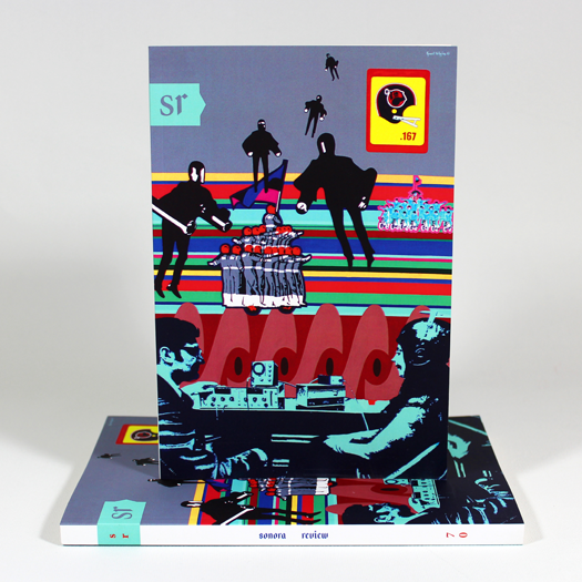
The New Logic has gained new life as the cover image for Issue 70 of Sonora Review.


It’s a tremendous honor to see my 2003 painting The New Logic featured on the cover of the current issue of literary journal Sonora Review.

Produced by graduate students of the Creative Writing Department at the University of Arizona, Sonora Review is one of the oldest student-run literary journals in the U.S. Its former staff members include David Foster Wallace and Richard Russo.

The New Logic is featured on Issue 70 of Sonora Review. It’s the second consecutive time in which my work has appeared on the journal’s cover. In spring of 2016, issue 69 showcased The Escape Machine, which is from the same series and era as The New Logic.

The New Logic is one of my darker paintings. When I asked Sonora Review Editor-in-Chief Janet Towle that she consider this painting, versus more upbeat sketches I had offered, I had the feeling this painting would more accurately mirror the unsettled psychology of our present moment.

As if combatting mass-paranoia, all persons portrayed in this painting — except for one — wear a helmet. Even the football helmet’s hammer-wielding mascot dons a hardhat. The lone exception is the psychotherapist in the foreground, who administers a biofeedback experiment on his willing subject.

In the distance, against a panorama of lurid stripes, flag-brandishing motorcycle corps seem destined to clash. Patrolling the skies, searching for an enemy of the state, are silhouettes of futuristic “firemen,” from François Truffaut’s film adaptation of Ray Bradbury’s novel Fahrenheit 451.

The football helmet in the upper right corner is of the Pittsburgh Maulers, of the defunct United States Football League, which Donald Trump is credited with destroying. The Maulers had a .167 winning percentage in their only season. To me, this reference was personal. While a fan of American football as a child, I had found myself completely uninterested in the sport as an adult. This was my ode to a lost passion, and the disappearance of an upstart league that had tremendous promise.

Page 179 offers three black-and-white images of paintings I have made over the years. In addition to The New Logic, pictured are Where Is Gibarian? and Stop Static (Before It Stops You).

paintings by grant wiggins in sonora review issue 70
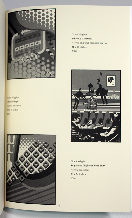
Paintings by Grant Wiggins showcased in Issue 70 of Sonora Review.


I am grateful to Editor-in-Chief Janet Towle for inviting me to share my work with readers of Sonora Review. Likewise I appreciate the opportunity she afforded me, in the biography section of the volume, to tell the story of how I started painting. Seizing the moment, I offered tribute to the poets, artists, and professors who shaped my own art:

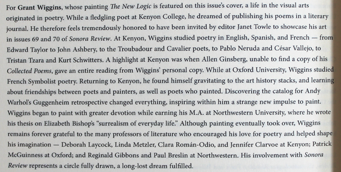
For Grant Wiggins, whose painting The New Logic is featured on this issue’s cover, a life in the visual arts originated in poetry. While a fledgling poet at Kenyon College, he dreamed of publishing his poems in a literary journal. He therefore feels tremendously honored to be invited by Editor Janet Towle to showcase his art in issues 69 and 70 of Sonora Review. At Kenyon, Wiggins studied poetry in English, Spanish, and French — from Edward Taylor to John Ashbery, to the Troubadour and Cavalier poets, to Pablo Neruda and César Vallejo, to Tristan Tzara and Kurt Schwitters. A highlight at Kenyon was when Allen Ginsberg, unable to find a copy of his Collected Poems, gave an entire reading from Wiggins’ personal copy. While at Oxford University, Wiggins studied French Symbolist poetry. Returning to Kenyon, he found himself gravitating to the art history stacks, and learning about friendships between poets and painters, as well as poets who painted. Discovering the catalog for Andy Warhol’s Guggenheim retrospective changed everything, inspiring within him a strange new impulse to paint. Wiggins began to paint with greater devotion while earning his M.A. at Northwestern University, where he wrote his thesis on Elizabeth Bishop’s “surrealism of everyday life.” Although painting eventually took over, Wiggins remains forever grateful to the many professors of literature who encouraged his love for poetry and helped shape his imagination — Deborah Laycock, Linda Metzler, Clara Román-Odio, and Jennifer Clarvoe at Kenyon; Patrick McGuinness at Oxford; and Reginald Gibbons and Paul Breslin at Northwestern. His involvement with Sonora Review represents a circle fully drawn, a long-lost dream fulfilled.

paintings by grant wiggins in sonora review issue 70

I traded a life in literature for one the visual arts at a fairly young age. The results haven’t been half-bad! Kidding aside, sometimes I wonder what that other life might have been.

Collaborating with Sonora Review over these past two issues has been tremendous fun. I have sincerely enjoyed reconnecting with literary circles. It’s encouraging to see work that I made more than a decade gain new life.


‘Pop!’ at {9} the Gallery in Downtown Phoenix

January 7th, 2017 | No Comments

grant wiggins in pop, at 9 the gallery in downtown phoenix
Now showing at Pop! at the Gallery in Phoenix: 19-6983, Looking Forward to Now, and Fantasia with 23rd Century Megastructures.


This month, for the first time in several years, I am exhibiting my art in Downtown Phoenix. From January 6 through February 1, 2017, three of my paintings will be on display in the group show Pop!, at {9} The Gallery, 1229 Grand Ave, Phoenix.

The paintings I’m showing are 19-6983 (2014), Looking Forward to Now (2014), and Fantasia with 23rd Century Megastructures (2006).

While my work has clearly gravitated away from my early roots in “acid pop” art, I am nonetheless exhibiting pieces that evidence mass-culture influences, namely product packaging and decorative design.

grant wiggins in pop, at 9 the gallery in downtown phoenix

Other artists participating in Pop! are Anthony Banayat, FunWow, Megan Koth, Lyndel Palermo, and Daniel Shepherd. More details at facebook.com/9TheGallery/

Many thanks to fellow artist David Dauncey for recommending my work to gallery owner Laura Dragon, to whom I am also grateful. This is a great way to start 2017!


‘The Escape Machine’ Showcased on Cover of ‘Sonora Review’

April 17th, 2016 | No Comments

grant wiggins' 'the escape machine' on the cover of sonora review issue 69
The Escape Machine on the cover of issue 69 of Sonora Review.


I’m honored and thrilled to see my painting The Escape Machine showcased on the cover of the newest issue of Sonora Review. My gratitude goes to Editor-in-Chief Janet Towle for the opportunity!

Produced by graduate students of the Creative Writing Department at the University of Arizona, Sonora Review is one of the oldest student-run literary journals in the country. Since its founding in 1980, the journal has published many highly respected authors, such as Denis Johnson, Mark Doty, Campbell McGrath, Maggie Nelson, Nick Flynn, and Lydia Millet.

Former staff members of Sonora Review include Antonya Nelson, Robert Boswell, Richard Russo, Tony Hoagland, David Foster Wallace, Joshua Marie Wilkinson, Tim Peterson, and Richard Siken.

Work originally printed in Sonora Review has appeared in Best of the West and Best American Poetry, and has won O. Henry Awards and Pushcart Prizes. More at sonorareview.com.

grant wiggins in sonora review
Back cover and artist bio in Sonora Review’s issue 69.


Painted in 2002, The Escape Machine represents one of my first experiments with incorporating pattern into my paintings. It also samples an image from a mid-1970s German instruction manual for the Odyssey video game console.

Playing their way into a feedback loop, the painting’s subjects seem to have fallen into a mirror world. The painting inquires how the virtual reality of video games might shape or reinforce everyday consensus reality.

I’m very encouraged to see work I made many years ago find new life. It’s also fantastic to have my work appreciated by literary circles!


Celebrating 20 years of painting

December 26th, 2014 | 1 Comment »

Well you’re in your little room, and you’re working on something good.
But if it’s really good, you’re gonna need a bigger room.
And when you’re in the bigger room, you might not know what to do.
You might have to think of how you got started, sitting in your little room.

— The White Stripes, “Little Room”

Twenty years ago this week, I painted my first painting. The experience of making that first work is something that I shall vividly remember. While I have made hundreds of paintings in the decades since, no other artistic experience I’ve had can quite match the feeling of adventure and freedom I felt when I was first starting out.

scramp king by grant wiggins
Scramp King, my first painting, which I painted in late December 1994.


Back then, I was a senior-year English major who wrote poetry and considering a career as an English teacher. Despite my stated ambitions, I found myself spending countless hours in the art section of my school’s library, transfixed by one art history book after another.

One title stood out: Andy Warhol: A Retrospective. I couldn’t put that book down! I had fallen in love with Warhol’s early advertising paintings — of household appliances of vacuums, drills, and refrigerators depicted in newspaper ads. In these seemingly unfinished portraits on canvas, everyday products were exalted.

Before returning home for Christmas break, I took out a loan for the Warhol retrospective catalog. I consulted that book continuously throughout vacation, each time feeling emboldened to start my own journey as a painter.

One night following Christmas, I took the plunge into making art. With images of Warhol’s paintings and a painting idea of my own glowing in my brain, I wandered into my mom’s art studio, tore the shrinkwrap from a pre-stretched canvas, grabbed some tubes of acrylic paint and a brush, and embarked upon realizing an idea for a painting that I had carried with me for more than a year: the wrapper of a 3M Scotch Brite sponge. Thing is, this new painting wouldn’t say Scotch Brite. I wanted it to say Scramp King! This was to be a portrait of a product that could exist only in a parallel universe!

scotch brite scouring pad by 3m
In the mid-1990s, Scotch Brite scouring sponges looked something like this. A wrapper that looked similar to this provided the source of inspiration for Scramp King.


Where did Scramp King come from? In the summer of 1993, I worked as a groundskeeper at an apartment complex. One project was to wash tenants’ front doors with Scotch Brite scouring sponges. (Man, were they abrasive! I scratched the heck out of quite a few doors!) In the process of removing dirt (and paint), the word “scramp king” jumped from a sponge’s wrapper into my brain, after I misread the packaging out of the corner of my eye.

That first painting seemed like such a transgressive act. It wasn’t the subject matter that was transgressive. It’s that I was a literature major who had never taken a studio art class — just a few art history classes. To me, painting is what studio art majors did! I felt like I wasn’t supposed to be painting. And yet, there I was, painting (straight out of tubes!) and working my way through a painting. I was taking a step toward becoming who I am.

Back at school, my friends told me they actually thought my painting was cool, and encouraged me to keep painting. Slowly, over time, I did just that. My confidence grew. But I never did take a studio art class. (Perhaps it shows!)

Reflecting upon what I have learned over the past two decades, a few lessons stand out. If I could go back in time and give myself advice, I’d probably tell myself the following five things:

1. If you want to make art, then make art! It’s that simple! You don’t need anyone’s permission or approval. Just make.

2. Never allow anyone talk you out of giving yourself to your art. I can’t tell you how important learning this lesson has been. People very close to me tried to convince me that devoting myself to my art was a kind of a selfish waste of time, that I’d struggle financially if I were to devote my life to making art. I was told I’d never make a living at it, and I’d be better off focusing on a career that made money. Unfortunately, at pivotal times, I listened to these people. But guess what? They were all wrong! The naysayers could never understand the bliss of having a great idea for a new painting, then finding a path to realizing it.

3. Take your work seriously, but don’t take yourself too seriously. Creative successes may come along — especially when you least expect them — and your visual agenda might be validated by a curator, gallery owner, or collector now and then. It’s nice to be recognized. But whatever happens, don’t believe your own hype! Stay humble. You’re only as good as your next painting.

4. Make art for yourself. For me, the true test of a work is whether I’m able to live with it on a daily basis. That said, making art with other people in mind doesn’t work for me. The applause or indifference of others is irrelevant. And don’t hope for others to like your work. If comrades or critics don’t like something you make, so be it. When you make art for yourself, the conversation surrounding the finished work is a separate matter. If something good happens, it’s bonus-round material.

5. Don’t compare yourself to other artists. And don’t compare your situation to that of other artists. As Theodore Roosevelt wrote, “Comparison is the thief of joy.” We sometimes read about artists who have ascended to international fame and fortune, or sell their work for ridiculous sums. Don’t let their success discount your self-opinion. Just because another artist seems to be “successful,” that doesn’t mean you can’t be, too. Keep believing in your gift. When in doubt, revisit point #4 above.

But ultimately, when I look back on 20 years of painting, I feel gratitude. I am grateful for having had the time, space, and gift of health to be able to make what I’ve made. I am grateful to my mom for allowing me to “borrow” her art supplies during Christmas break 1994, and to my sister who taught me how to mix paint. I am grateful to all of the fellow artists, friends, loved ones, collectors, and curators who have believed in my talent, and have supported me over time.

Being an artist can be a crazy calling to have. But I wouldn’t trade it for anything. Here’s to 20 more years!

— Grant Wiggins


The Story Behind My New Painting, ‘Stop Static (Before It Stops You)’

March 9th, 2014 | No Comments

What could the conveyance of visual energy, a magpie sampling aesthetic, and reclaimed stretcher bars possibly have in common? These are all things I have been thinking about as I have produced my newest painting, Stop Static (Before It Stops You).

grant wiggins - stop static before it stops you
Stop Static (Before It Stops You). Acrylic on canvas. 30 by 24 inches (76 x 61 centimeters). Commenced on the afternoon of Tuesday, February 25, 2014. Deemed complete on the afternoon of Saturday, March 8, 2014.


The primary inspiration — my starting point — for this painting is a simple box of Bounce fabric softener, an everyday object with a design that has captured my imagination for years. I love Bounce’s logotype, especially its double outlines and undulating, interlocking shapes. You may note how the lower left curve in the logotype’s “B” forms the striped motif in the upper right quadrant of the composition. What’s more, the fluorescent orange halftone pattern in the painting echoes the halftone on the box, shown below.

bounce fabric softener
A box of Bounce: What started everything for this painting.


In honor of the inspiration for this painting, I originally considered naming this piece Bounce Rate. This title could have been a nod to my experience in web content consulting. “Bounce rate” is a metric of web visitors who leave a site within five seconds of arriving; they “bounce,” in effect. Yet, I wanted to push this idea further, so I searched for figures of speech involving the word “bounce.” While that proved fruitless, I soon stumbled upon a Bounce fabric softener ad campaign from the 1990s, which had the memorable tagline “Bounce Stops Static Before Static Stops You.”

Conveying visual energy

Considering this tagline at length, and reflecting further upon what this painting represents to me, I adjusted the painting’s title again, to Stop Static (Before It Stops You). The reworked phrase sounds more like a suggestion — to keep oneself from staying still, and continue to move forward, to keep growing. The painting can serve as a visual reminder to avoid falling into ruts in day-to-day life.

I found that the new title had much in common with a central idea that I have been developing about my paintings, as a whole — that they are conveyances of visual energy. This idea came to me when one of my patrons wrote to me about some of my framed prints, which he displays in his office:

Every day [the prints] inspire me to try to pretend to be the kind of person who approaches the world with the energy and color jumping out of those little squares.

What immediately struck me about this sentence is the word energy. This is what my paintings are all about! The experience of feeling energy is what I want my paintings — especially my maximal paintings — to embody. Energy is what I want to convey through my work.

A sampling aesthetic: Merging my favorite graphical motifs

Without question, this painting is very much an homage to — and an energetic collision involving — graphical elements that fascinate me.

In addition to Bounce-inspired stripes and a classic halftone pattern (I have always loved halftones, and can never get enough of them), Stop Static also incorporates a heraldic vair ancient pattern (found in the upper left corner of the painting), and stripes of decreasing widths (another favorite motif).

Yet, the “star” graphical element is a rising diamond pattern — called “diamond haze,” I believe — by Diane von Furstenberg. For years I have admired this pattern, and have wanted to incorporate it into a composition.

von Furstenberg’s current exhibition at the Wilshire May Company Building in Los Angeles, The Journey of a Dress, has offered a perfect occasion to do so. The diamond haze pattern can be found on many of von Furstenberg’s signature wrap dresses. It also adds a visual rhythm to the walls and the floors of the exhibition. This is a classic and timeless pattern. It’s so perfect that I wish I had developed it myself. Bringing it into my work — much like sampling in music — is a way of paying tribute.

Although this painting is very much an amalgam of my favorite things, in terms of graphic motifs, ultimately I believe that this painting asks to be seen on its own terms, free of the context I just offered. There is no narrative to be had here. There is nothing to get. This painting affords a purely visual experience — and I hope it’s an energizing one, at that.

The role of “reclaimed” stretcher bars

The stretcher bars supporting this canvas are literally more than 15 years old (from the late 1990s), and recall a time when I was first learning how to paint. The bars were originally part of a pre-stretched canvas that I acquired from a store. (I haven’t purchase pre-stretched canvas in years! So much has changed.)

The painting I attempted to make on the pre-stretched canvas never got anywhere. I abandoned it, and left it in my dad’s house, where I stored many of my early works, along with my mom’s paintings.

In attempt to clear out his house, my dad recently returned to me several half-finished canvases and untouched canvas panels. What is this?, I thought, when he handed me one canvas after another. It was so hard to look at my early work! It’s awful stuff, to be honest. I struggled mightily to paint back then, and it’s evident in my brushwork.

Back at my studio, seeing this pile of old, half-finished pieces every day was a drain on my energy. Taking the canvases off the bars and rolling them up helped clear my mind.

Left with the bare stretcher bars, I realized that I had an opportunity to start over — returning to the past, building upon the past, and being reminded of how far I’ve come in 15 years. What’s more, I could make this new painting at an out-of-pocket cost of zero, using canvas, gesso, and paint that I already had in inventory. In effect, I had nothing to lose!

In the end, it was a joy to make this painting, and I hope this enjoyment comes through in my work. There were several times along the way, as I painted this piece, when I reflected on how thankful I am to be able to paint. Painting really does give me pleasure. It’s often not easy work, at all, but the rewards are profound.


‘A Show of Hands’ at Tucson Museum of Art

September 20th, 2013 | No Comments

a show of hands at tucson museum of art

My 2005 neo-pop painting, Hands, will be on view throughout this fall and early winter at the Tucson Museum of Art, in the exhibition A Show of Hands.

As one might expect, this show will bring together works of art — paintings, photography, works on paper, and sculptures — that explore the metaphorical potential of hands. A partial list of artists included in this exhibition includes Fernand Léger, Alice Briggs, Enrique Chagoya, Robert Colescott, Dan Collins, Bailey Doogan, Enrique Martinez Celaya, Christopher Pelley, Craig Smith, Buffie Saint-Marie, and others, including yours truly.

Looking back, I consider Hands a transitional painting in the evolution of my work, for it’s one of my last true pop art paintings. Following the tried-and-true path of painting what one knows, Hands is a mash-up of packaging elements from household products — including Reynolds aluminum foil, instructional illustrations on the back of a noodle packet, and the bubbles found on a box of cleaning product.

Bringing these elements together, this painting could just as easily be titled “The Pure Products of America Go Crazy” — the great opening line from the poem “To Elsie” by William Carlos Williams. It seems to ask, what if everyday products were to go haywire, in a hallucinatory way? Perhaps this painting pokes fun at the gimmickry of consumerism, and perhaps it also points the way to an imagined world where everyday products could be completely unpredictable.

This marks my sixth time exhibiting at Tucson Museum of Art over the past 10 years. In addition to participating in the 2003, 2005, 2007, and 2009 editions of the Arizona Biennial, I also showed in Thanks for Being with Us: Contemporary Art from the Douglas Nielsen Collection, in 2010.

A Show of Hands opens September 21, 2013 and will remain on view through February 9, 2014. More details at tucsonmuseumofart.org.


In the studio January 17, 2010: Abstract pop art?

January 17th, 2010 | 2 Comments

abstract pop art
Work in progress: A painting called Hypermodic Spastaculatron, as of 5pm on January 17, 2010. Lots of fluorescent paint going on. Is it abstract pop art, or something entirely different?


The latest news from my studio is this:

My Spring/Summer 2010 collection of paintings is officially “on.” Projected launch date is May 15, 2010.

This will be a decidedly “maximalist” series of paintings. (See more in this style in my maximal abstract art gallery.) This will be a departure from my Fall 2009 Collection, which was focused completely on minimal, geometric compositions.

I am not sure whether labels from the 20th century, such “abstract” and “pop art” really define what I’m painting. (“Abstract pop art” doesn’t quite work, either!) What I’m painting is something new, something that defies categorization, something that hasn’t been seen before. I’m gathering new shapes, patterns, and colors and throwing them into the future.

A New Year’s ambition of mine is to paint one painting per week. The Spring/Summer collection would therefore roll out with 16 pieces, if I’m lucky. Year to date, I have completed 0 paintings. Today, I am still working on version #3 of painting #1 in the collection, shown above. I shall persist.

abstract pop art
Choosing my colors: In the studio on Saturday, January 16


All of this considered, I want to show you progress on my work as best as I can. Yet, I also want to keep the collection under wraps until the launch date. Therefore, I shall offer you glimpses of paintings in progress, when available. Just like above.


Minimalism meets pop art

December 8th, 2008 | 3 Comments

Last week’s production included two paintings (10 x 16 inch, or 25.4 x 40.6 cm) studies inspired by the SEPTA logo.

pop art minimalism

I’ve posted both to flickr. Above is Spectral 2, which seems to me a bit packaging-inspired, even though that’s not the case. Midway into making it, I decided not to flood the perimeter of the canvas with red; instead, the red merely outlines the yellow and white stripes. So perhaps I will begin to pursue a middle-ground between minimal design and graphic design, voyaging back into packaging-inspired works. I feel as if I have been searching for a combination … and I know the floodgates will open when I discover it.

In other news:

• I think I’ve devised the perfect bright red, which has the most intense luminosity of bright red ink. It’s one part naphthol red light, one part fluorescent red. The result is excellent, although it requires six coats. This color lacks the overt fluorescence of fluorescent red, and is more opaque. Completely eye-popping!

• I enjoyed reading this article about Sol LeWitt at Mass MoCA, in yesterday’s New York Times

• I found the Julian Schnabel interview on 60 Minutes compelling last night. Schnabel utterly lost it when Morley Safer breathed mention of critic Robert Hughes. His reaction was visceral. See for yourself here. My take-away was this: If you care that much about what others write and say about your art, you’re probably making art for the wrong reasons. It’s hard to see someone get wound up by a critic. Focus on making the art instead. Make art for yourself. That should be reward in itself. To hell with the rest.


Another painting just finished!

October 27th, 2007 | 3 Comments

I’m happy to say that I just finished An Error Occurred While Processing This Directive yesterday, a photo of which is shown below. I’m not sure where the idea came from or what it all means, but I’m stoked that I got it done and I’m ready to move on to the next idea rolling around in my brain!
another painting just finished
On that note, a couple of weeks back I came across a fantastic article in New York Magazine titled “Has Money Ruined Art?” Author Jerry Saltz raises some important questions about what’s going on in the “art world” (a term I have never been comfortable with) today: students charge $25,000 for paintings, art collectors view pieces as currency, “third-rate product” by “second-rate artists” is going for half a million dollars U.S.

Reading this article, I wondered to myself what I’ve been missing out on, if anything, considering how that kind of talk is completely foreign to me. I deliberately chose to live in Phoenix, rather than move to New York, because 1.) I don’t care what’s going on in the “art world” and 2.) the quality of sunlight in Phoenix is phenomenal. There’s nothing like the Arizona sun striking fluorescent paint.

Ultimately, I have chosen a life that is not affected by market pressures. I can paint whatever I want. And I think it’s totally appropriate for so much boring, insipid art to command high values. That’s typical. The “art market” (another term I dislike) has never made sense to me. The quality of a work of art and its value rarely match up. What’s more, wealth does not guarantee taste. Lots of mansions are filled with utterly hard-to-look-at works of art.

Mr. Saltz’s article also quoted art critic Peter Schjeldahl as saying that the excess of money flowing around has “allowed many artists to lose what should be the No. 1 lifelong fear of all artists: making a bad piece of art.” I’ve reflected considerably on this quote, and I respectfully take issue with it.

The process of making art, for me, is not a matter of good vs. bad. That kind of thinking is very Western, and needlessly reductive. I do not think of right versus wrong, or worry whether a painting will be good. At one point, I did, and it got me into considerable trouble. Rather, I see art-making as a process that starts with trusting oneself. You have an idea, you go with it. Don’t second-guess it. Just let the process be the guide. The self will shine through. Whether others will like what I make is another matter; I cannot control that. I simply try to enjoy the process of making. And if my work comes off as seeming like The Weirdest Art in the World, so be it.

To sum up, artists have to make art for themselves. Money, social prestige, critical praise, biennials — all of that just messes things up, in my opinion. And that’s why I live completely off the “art world” map.


Synthetic Landscape showing in Global Warming, starting Saturday

August 28th, 2007 | 1 Comment »

Synthetic Landscape by Grant Wiggins
Set for the trip: Synthetic Landscape in my studio on Sunday afternoon.


On Monday, Olivia and I drove to and from the Orange County Center for Contemporary Art, delivering Synthetic Landscape for the upcoming Global Warming: Artists Speak show.

A 742-mile round trip. Left at 8am (was planning on borrowing my in-laws’ van, but the painting was three inches too long, so we had to hustle to Enterprise to rent a cargo van, which worked brilliantly, but we departed two hours later than planned) and returned to Tempe at 9pm. It was a haul.

(Yes, I am fully aware of the irony of driving a van — which gets 15 mpg on highways and consumed approximately 50 gallons of gas during the round trip — to a show about global warming. There and back, the van emitted about 1,000 lbs. of CO2 emissions. I hope it was worth it.)

But I must say that the people at OCCCA are supernice. Had a pleasant chat with Laura Hines-Jurgens, the curator of Global Warming, and Barbara Thompson, director of exhibitions. Very enthusiastic and cool people. I’m really glad to be a part of the show.

Things have been a bit overly hectic lately, with freelance writing work (a good thing) and fixing up Synthetic Landscape (not such a good thing). I devoted Saturday to repainting parts of Synthetic Landscape that I was never happy with. The uneven sheen in some of the paints I used (despite matte medium), especially in the “Chevron mountains” part, had been irritating me for about three years. So I repainted the dark blue stripe, the green grass, the orange in the Gulf logo, and the light blue sky. In all the colors are much more intense, and I’m really happy about that.

OCCCA is spacious and historic gallery (was once an auto showroom, going back to the 1930s). I found downtown Santa Ana quite charming, as well. I recommend the completely restorative peach and banana smoothie at The Gypsy Den.

You will find Synthetic Landscape featured on the homepage of both OCCCA and the Santa Ana Arts District’s site (santaanaartsdistrict.com).

Global Warming: Artists Speak will open at the Orange County Center for Contemporary Art this Saturday (September 1) at 6:30pm. More details at occca.org. Sadly, though, I won’t be attending the opening. The show runs through Saturday, September 29.