Tag: reductive art

New Minimal Paintings: The ‘Voyedge’ Series

September 8th, 2015 | 1 Comment »

New Minimal Paintings: The 'Voyedge' Series
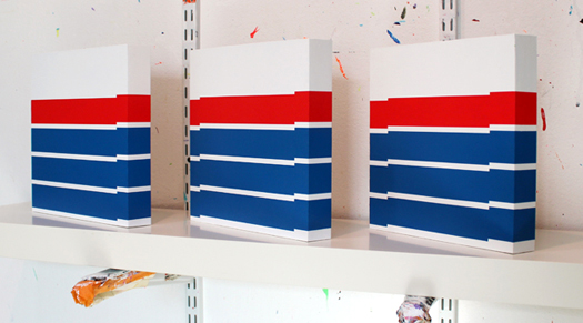
Three studies for my Voyedge series of minimal paintings.


My most recent artistic voyage has been my Voyedge collection of new minimal paintings. This series is very hard-edge in spirit, and is in many ways a descendant of my ‘Confluent series of paintings, from January of this year.

Thus far the Voyedge series encompasses five small studies and two larger minimal paintings. Down the road, I’d like to continue to explore different colorways with this series — particularly combinations involving fluorescent colors.

New Minimal Paintings: The 'Voyedge' Series by Grant Wiggins
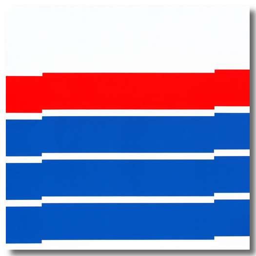
Voyedge 1. 2015. Acrylic on canvas. 40 inches square (102 x 102 cm).


With the Voyedge series, my commitment to hard-edge, minimal painting remains clear. This is a way of making art that has felt like second-nature to me for many years.

New Minimal Paintings: The 'Voyedge' Series by Grant Wiggins
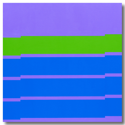
Voyedge 2. 2015. Acrylic on canvas. 40 inches square (102 x 102 cm).


If one tendency, or evolutionary theme, emerging in this side of my work, I would say that it is becoming more angular — increasingly characterized by right angles.

There is something about the square, and the straight line in general, that is completely modern to me. The square is the progenitor of the pixel, the essential building block of digital culture. Expressing the same design in straight lines, as opposed to curves, somehow yields a more contemporary expression.

New Minimal Paintings: The 'Voyedge' Series by Grant Wiggins
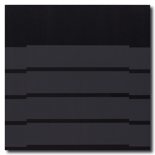
Voyedge 3 (‘Darkhorse’). 2015. Acrylic on canvas. 40 inches square (102 x 102 cm).


I realize that minimal painting is not for everyone. These sparing compositions, as a rule, have clean lines. They are nonobjective in nature; there are no mountains, or flowers, or portraits to relate to. As such, these paintings resist narrative.

Perhaps this is what I find so enjoyable about minimal painting: The making of something new, materializing an otherness not found in the everyday world that surrounds us.

New Minimal Paintings: The 'Voyedge' Series by Grant Wiggins
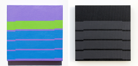
Voyedge studies, from left: Voyedge 2 (Study); acrylic on canvas; 10 inches square (25.4 x 25.4 cm). Voyedge 3 (‘Darkhorse’ Study); acrylic on panel-mounted canvas; 10 inches square (25.4 x 25.4 cm).


The Voyedge collection continues to evolve. I look forward to sharing more pieces with you soon.


Julian Stanczak interview on Geoform.net

November 4th, 2011 | 2 Comments

I remember the first time I ever saw a painting by Julian Stanczak in person. It was at the Toledo Museum of Art, several years ago. Standing before And Then There Were Three, in all of its 4-foot-by-12-foot vastness, I literally felt myself being engulfed by the colors and forms before me. Green and red were banging against each other, forming a warm brown, vibrating against several rhythmic progressions of purples.

julian stanczak interview - and then there were three
And Then There Were Three by Julian Stanczak. 48 x 144 inches (122 cm x 3.7 m). 1971. Collection of Toledo Museum of Art. Photo by Faasdant via flickr.


I remember trying to focus on just one color — training my eyes to carefully scan the canvas from bottom to top edge, in a vertical line — and noted how my perception of that singular color changed, based on its proximity to other colors.

The more I gazed at And Then There Were Three, the more I fell into it, as if a gravitational pull had lured me into a radically different (and far more interesting) reality. I couldn’t pull myself away. I was in bliss.

That moment at Toledo Museum of Art changed my thinking about art and how I saw my own art. Julian Stanczak had joined my personal constellation of art superstars.

Ever since, I have followed the arc of Stanczak’s career with great interest. I have enjoyed the resurgence in interest in his work — as evidenced by his inclusion in the Optic Nerve, presented by Columbus Museum of Art in 2009, as well as CLE OP: Cleveland Op Art Pioneers, on view through February 26, 2012 at Cleveland Museum of Art.

The fact that Stanczak is a Clevelander — he resides in Seven Hills, one suburb east of where I grew up (Hint: It rhymes with “pharma.”) — who attended Cleveland Institute of Art around the time my mother did (ca. 1950), makes him even cooler.

Naturally, when Julie Karabenick, editor and curator of Geoform.net, contacted me last week to let me know that she had just posted an interview with Stanczak, I virtually flipped out. At first, I tried to read the interview on my phone, but quickly stopped once I realized how comprehensive it is.

Clocking in at more than 15,000 words (23 pages of 10-point type, without images, expertly led and transcribed by Karabenick), this interview is a definitive, tour de force window into how Stanczak sees his work, his influences, and his creative process. Read the complete interview on Geoform.net here.

“Color Meltdowns”

Several themes continually resurface throughout the interview. Stanczak’s love of color emerges early; he views color as “abstract, universal — yet personal and private in experience. It affects us emotionally, not logically as do tangible things.”

As the interview progresses, Stanczak’s insights take on a gravity not unlike Paul Klee’s near-mystical observations in The Thinking Eye, but with a playfulness and optimism shared by Verner Panton. You intimately sense Stanczak’s love for color, and his deep interest in creating a visual sensation for the viewer, through interactions between colors.

“I want to fuse many colorants and their gradations into a single color experience — a ‘color meltdown,'” he says. “I am interested in the glow of colors as they interact and intermix, as they give to each other. And there are many factors I must consider to achieve the desired meltdown.”

He speaks of his paintings as an “interactive fusion” of colors, where “visual elements lose their individuality for the sake of totality.” Stanczak’s canvases are surfaces upon which colors invite our eyes to mix them into entirely new colors, forming a “haze” or “glow” as they interact.

Nature as the greatest teacher

Unlike anything else, the natural world has challenged and inspired Stanczak to experiment with colors, forms, and its many sensations. The artist expresses an instinctual fascination with the geometry and visual rhythms that permeate life.

“More than any of my teachers, Nature directed me, and I gained more conviction through, for example, observing water reflections, river currents, wood grain or grasses swaying,” Stanczak says. “In many of my studies the rhythmic use of line or shape refers to weather and light.”

During his early teaching career in Cincinnati and Cleveland, in the late 1950s and early 1960s — a time of great isolation for the artist — nature was Stanczak’s one constant.

“With no one to promote my clean geometry, whom could I turn to for some kind of confirmation? — to Nature, as always,” he observes. “I have always felt that Nature harbors the answers to all my questions.”

Josef Albers

Stanczak’s recollections of Josef Albers, one of his professors at Yale, form a particularly fascinating section of Karabenick’s interview. The artist remembers:

At Yale one of the first lessons I heard from Albers was, “I cannot teach you your art!” Albers used destruction as a method of construction in his teaching. Anything you thought you knew was taken away. The principle was not to get attached to anything too early, but to keep looking, searching, and thinking. Albers made endless demands for you to be better, to be a more observant participant in life. You experienced total emancipation from what to do, how to do it and what to think.

[Albers] gave me the courage to explore color beyond the classroom. He gave me the mindset to accept questions as part of life’s energy. My paintings and my search for understanding of color were based on a step-by-step process of observation. My observations might not match those of another person, but they became my foundation to build upon. I was gratified that Albers chose to include one of my pieces in his Interaction of Color portfolio.

Albers emerges later in the interview, when Stanczak drove to New Haven to invite Albers to the opening of his first solo show in a New York gallery — Julian Stanczak: Optical Paintings, at Martha Jackson Gallery in 1964. The exhibition’s title unnerved Stanczak, but particularly rankled Albers.

Stanczak remembers:

I found him aroused, pointing to the exhibition announcement in the paper. Without a greeting he said, ‘Your obligation is to correct that!’ I asked him what term he would use to describe the work, and he said ‘Perceptual painting.’ He was imperative about my responsibility to take action against something like this. I tried, but the term had already entered the public domain.

Stanczak viewed his paintings as an opportunity for “perceptual experience,” not purely optical experience. The latter was, in his opinion, a matter of merely “registering visual actions blindly.” Pattern and illusion — eye-attacking art-making tactics, on their own — never motivated Stanczak the way they did so many of his contemporaries.

Reading Karabenick’s interview is like a walk through time, spanning Stanczak’s life and the art currents surrounding and shaping him. The interview offers remarkable insights into one an artist’s lifelong approach toward color, form, and his highly individualistic art-making process — which undoubtedly has involved many miles of tape.

I consider this interview a gift that will continue to unfold new meanings as I re-read and reflect upon it, in a way very similar to seeing Stanczak’s paintings in person, up close. It is a master class that any artist can attend, and I am thankful for the opportunity to have experienced it.


Press coverage of my Soyal Gallery show

May 11th, 2010 | 3 Comments

As my show at Soyal Gallery nears an end (It closes this Saturday, May 15.), I’d like to share a couple of press clippings that have cropped up over the past two weeks. I’m quite pleased to say that my work has graced the pages of Phoenix Home and Garden (May issue.), Scottsdale Republic (Saturday, May 8 edition; image here) and Java Magazine (May issue, all through the ever-popular Club Cam section).

Here’s the Phoenix Home and Garden clip:

phoenix home and garden

As this article was in development, writer Judy Harper asked me where my painting titles come from. Interesting question! And this became the focus of the write-up. For a bit more context, here is my full response, dated March 18:

“By nature, my paintings are nonrepresentational. In other words, they don’t depict, or represent, anything found in reality. Some artists paint pictures of cows, landscapes and people. I’m different, I guess. I have always wanted to paint things that don’t exist, whether it’s made-up product packaging or geometric elements. That said, there’s nothing to ‘get’ about my work. Everyone should be able to see my paintings for what they are: paintings.”

“I believe that titles have a way of forcing the viewer to see something in a painting, or make sense of what is going on in the painting. Therefore, I deliberately choose titles that don’t mean anything … they are merely combinations of letters, generated by software or scrambled translations. To me, this makes more sense than naming a painting Untitled.”

“Long story short, I don’t want to color the viewer’s perceptions of what they see. The painting should stand on its own. Before my paintings, viewers should have the opportunity to experience the literal act of seeing.”

Also, I’d like to thank Java Magazine Publisher/Editor Robert Sentinery for publishing several images of my Soyal show opening, which was a great time. Do take a moment to see the full issue here. Below is a sample; see images 3 and 8.

On that note, I’m back to the easel, painting away. No time for stopping!


New images of my Scottsdale contemporary art show now on flickr

April 4th, 2010 | No Comments

Scottsdale Contemporary Art

Images of Circles with Corners, my current Scottsdale contemporary art show on Marshall Way in Scottsdale, are now available in this flickr set. I thank my friend Robert Bell for helping me take some ultra-high-res images.

Presented by Soyal Gallery, my Scottsdale contemporary art show brings together 35 paintings that I have made over the past four years. My fall 2009 collection of contemporary abstract paintings forms the nucleus of this show.

I’m very pleased about the coverage that this show has had in the media so far. Locally owned Java Magazine gave my exhibition a full-page article, written by Scott Andrews. Likewise, Phoenix New Times blogged about Soyal and other upstart Marshall Way galleries that are changing the Scottsdale contemporary art landscape.

Our opening-night turnout was fantastic, as well, and I thank everyone who stopped by to say hello.

I have more exciting news to share with you very soon. Meantime, hope you enjoy my new set of images on flickr.

Scottsdale Contemporary Art


A new reductive art work in the works

July 13th, 2009 | No Comments

Reductive Art

Wanted to freshen up the blog a bit, so I’m offering you this peek of what I’ve been sketching lately. There’s lots more like this in the works, I can assure you.

I’m very much into following minusspace.com, which offers unparalleled coverage of developments in reductive art around the globe.

In reductive art, everything you bring into a composition must be weighed carefully. I realize that this art is not for everyone. There’s a small, but ardent audience for it. But I don’t mind: The potential for reductive art has once again captured my imagination.

More paintings like this in my site’s minimal art gallery.