Tag: design

Poster for Maricopa Community Colleges Student Art Competition

October 19th, 2011 | No Comments

A new poster, based upon one of my recent paintings, will soon be circulating throughout the 10 campuses of Maricopa Community Colleges (MCC), promoting the college system’s 26th Annual League for Innovation Student Art Competition.

MCC student art competition poster
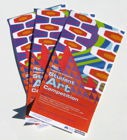
Posters for Maricopa Community Colleges’ 26th Annual League for Innovation Student Art Competition.


The poster is based upon my 2010 painting Flat Space, Imagined Place. MCC designer Janet Sieradzki used the graphics file that resulted from original digital sketches for the painting. (Since 2001, I have designed all of my paintings digitally before painting them.)

I’ve enjoyed a fruitful, collaborative relationship with Maricopa Community Colleges over the past several years. In 2004 and 2005, I designed a pair of posters for MCC’s Honors Forum Lecture Series. My art has been featured on a 2007 faculty convocation program and a collection of winning entries for a 2007-2008 student writing competition.

MCC student art competition poster
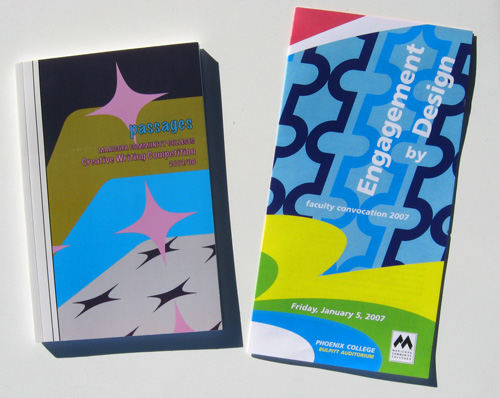
2007-2008 MCC publications featuring designs adaptated from my paintings.


Overall, I’m very happy with this new poster, and I’m very excited to see how the art competition turns out. My thanks go to Ms. Sieradzki for inviting me to share my work. It has been a pleasure to collaborate with her yet again!


Please make the 1980s go away…for once and for all.

February 19th, 2009 | 2 Comments

Face it: In terms of design, the 1980s was a wasteland. Postmodernism was cool. … And Panton went pastel, for crissakes.

But the decade’s lack of design sensibility is coming back more and more each day. And it’s bad.

Do your best: Please make the 1980s go away. Karl Lagerfeld knows what’s going on. Converse with him. Think about the future, even if it means drawing from the past. Nostalgia is an enervating pursuit.


Pride for my friends

February 12th, 2009 | No Comments

Pardon me while I brag about a friend; I’m very impressed with this. So writes Jesse “Arbito” Hibert on arbito.com:

“Several months ago I was approached by Nike to design a psychedelic illustration that would be used to wrap around a special limited-edition set of Danny Kass Nike Zoom Force 1 snowboarding boots. Nike liked the design so much they expanded my design to include a Jacket, shirt, posters, and an animated video.”

I therefore invite you check out the video based on Arbito’s utterly fantastic work:


Somewhere between Tom Wesselman and Peter Max: On another Hibert-related note, I’d like to share with you my gratitude for something my friend Oliver Hibert (Jesse’s cousin) was responsible for. In issue X of Beautiful Decay magazine, Oliver is featured in a four-page spread (pages 40 – 43). When asked “What other artists influence or inspire your style, Oliver discusses his family members (Jesse, his sister-in-law Snaggs Hibert, and his brother Spencer Hibert), then adds (emphasis mine):

“Some of my other favorite artists include Keiichi Tanaami, Guy Peellaert, Henry Darger, Tom Wesselman, Grant Wiggins, Heinz Edelmann, Peter Max, Dali, Roger Dean, [and] Eduardo Paolozzi, to name a handful.”

Oliver, I hope you know how much that means so much to me. Thank you.


Line vs. color: Reconciling early Bridget Riley and Verner Panton

February 7th, 2009 | 4 Comments

To be honest, when considering the massive polarity between line and color found throughout art history—between the Poussinistes and Rubenistes, between Ingres and Courbet—I’ve never taken sides. Perhaps it’s because I’ve never taken a life drawing class (and I have no wish to do so), and my early interest in packaging design. I always thought that a colorful stripe, slashing the pictorial plane, perfectly embodies both approaches. And when I first read about Ingres and Courbet’s vehemence for each other, I found their argument somewhat quaint.

Yet, my thinking has evolved considerably of late. For the first three weeks of January, I was immersed in two Verner Panton books: His Vitra Design Museum retrospective catalog and Lidt om Farver (Notes on Colour). The two books have changed how I approach color in my own work; Panton was completely daring in his use of colors, and he shunned white.

Since then, I’ve been reading about Bridget Riley, trying to gain more insight into her radical early Sixties op art paintings. I am completely fascinated by these pieces’ startling originality. They blow my mind—and seem to have been generated from nowhere. In 1959, Riley makes a copy of Seurat’s Le Pont de Courbevoie. Two years later, she paints Kiss, and then Blaze I in 1962. Riley’s works from 1961 – 1965 are all achromatic.

Thus, paring Panton’s turn-of-the-Seventies Visiona environments and Mira-X textiles with Riley’s work just a few years prior offers a plenty of grounds for comparison and contrast. Each is a master of an approach. They share is an art form that is purely optical and dangerously hypnotic. Perhaps most importantly, these works shun intellectual treatment. Dave Hickey’s assessment of Op Art (found in the Optic Nerve catalog) helps explain this: “Op does its own work for whoever will look. It dispenses with the repertoire of knowledge and experience that is presumed to be required to appreciate abstract art. It replaces the elite intellectual pleasure of ‘getting it’ with the egalitarian fun-house pleasures of disorientation, of trying to understand something you cannot … As we stand before Op paintings that resist our understanding, we introduce ourselves to our unconscious selves. We become aware of the vast intellectual and perceptual resources that await our command just beyond the threshold of our knowing.”

For as much as I appreciate Panton and Riley, their approaches are hard to reconcile. Panton was a master colorist, and he mined the optical power of subtle changes in hues, shades and values. But foremost, he was a designer, and he approached color from the perspective of function. “Using colours is like life,” he wrote in Notes on Color. “One must have a goal. The goal can be almost anything—also make the most awful colour combinations.” And he writes elsewhere, “Choosing colours should not be a gamble. It should be a conscious decision. Colours have a meaning and function.”

Verner Pantons Onion pattern

Verner Panton’s Onion 2 textile

Quite the opposite, Riley admitted to struggling with color early in her career. Her early paintings aimed for maximum contrast, which is why she chose black gouache on white paper (or white over black ink on plexiglass for her silkscreens). In the early 1960s, Riley chooses to produce work that is “beautifully aggressive.” As she explains in Dialogues on Art, a series of interviews with the artist, “Contrast is the clash of cymbals, the exclamation mark, the strongest possible means. That I wanted; I felt very much at the time like making an extreme statement, of something violent, something that definitely did disturb.” A complete assault on the optic nerve!

Bridget Riley’s 1965 painting Arrest

I’m charging myself with reconciling the aesthetic principles of Panton and early Riley. That’s where my mind is at right now. I want to produce work that perfectly balances line and color. I want to make works that dazzle the optic nerve, transporting the viewer into the fourth dimension. And if I am working with pattern, I will also be employing a sense of intrinsic structure and compositional order.


Two of my favorite logos

December 2nd, 2008 | No Comments

On Saturday I was searching for “1970s corporate logos” via Google image search and I instantly found two new favorite logos — both from Pennsylvania, at that. These “finds” (one of which is undoubtedly an everyday sight for Philly residents) offered me instant inspiration, leading me to fill my notebook with possible ways of remixing these logos into new designs.

styles of paintingstyles of painting

Above are the logos of SEPTA (from phillyist.com) and, to the right, Penn Central Company (from scripophily.com).


Painting provides theme for new creative writing book

April 1st, 2008 | 2 Comments

Something incredibly cool has arrived in my mailbox. Make that under my mailbox — it was too big to fit!

I just received a couple of copies of Passages, a collection of fiction, essays, and poems submitted to the Maricopa Community Colleges Creative Writing Competition. On the cover is a tightly cropped image of a painting I made back in late 2006, titled Still Life with Inverted Florida Maritime.


Left: The cover of Passages. Right: My 2006 painting Still Life with Inverted Florida Maritime.


An inventive way of introducing
the Essay section.


What’s really cool is that the book’s designer, Janet Sieradzki, isolated elements of the original design and incorporated it through the rest of the book. (I provided her with the original Illustrator file.) In other words, in the Fiction section, you’ll see a group of diamonds; Essay features a diagonal borrowed from the design’s stripes.

It’s fascinating to see how a designer can run with my work and make it new. I see my own work in a completely new way. And it’s refreshing to see my work in a completely unexpected context — a college writing contest.

Congratulations to Janet Sieradzki for doing something new with my design! Nicely done, Janet!