Tag: paintings

‘The Escape Machine’ Showcased on Cover of ‘Sonora Review’

April 17th, 2016 | No Comments

grant wiggins' 'the escape machine' on the cover of sonora review issue 69
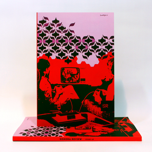
The Escape Machine on the cover of issue 69 of Sonora Review.


I’m honored and thrilled to see my painting The Escape Machine showcased on the cover of the newest issue of Sonora Review. My gratitude goes to Editor-in-Chief Janet Towle for the opportunity!

Produced by graduate students of the Creative Writing Department at the University of Arizona, Sonora Review is one of the oldest student-run literary journals in the country. Since its founding in 1980, the journal has published many highly respected authors, such as Denis Johnson, Mark Doty, Campbell McGrath, Maggie Nelson, Nick Flynn, and Lydia Millet.

Former staff members of Sonora Review include Antonya Nelson, Robert Boswell, Richard Russo, Tony Hoagland, David Foster Wallace, Joshua Marie Wilkinson, Tim Peterson, and Richard Siken.

Work originally printed in Sonora Review has appeared in Best of the West and Best American Poetry, and has won O. Henry Awards and Pushcart Prizes. More at sonorareview.com.

grant wiggins in sonora review
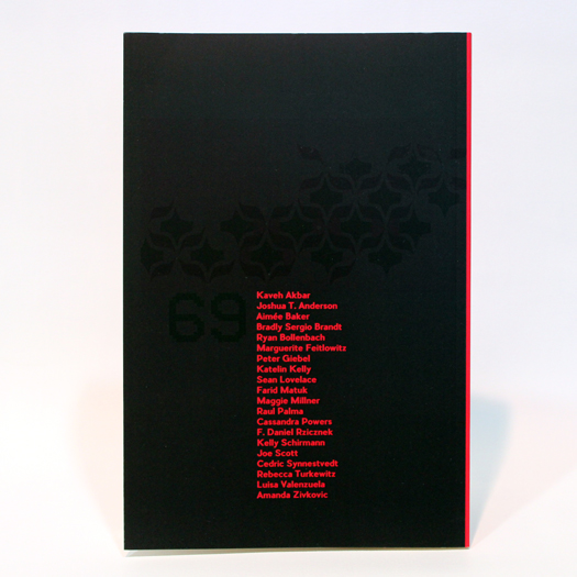
Back cover and artist bio in Sonora Review’s issue 69.


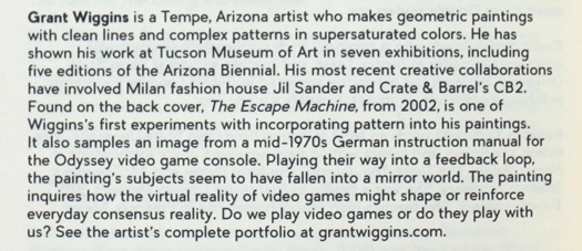
Painted in 2002, The Escape Machine represents one of my first experiments with incorporating pattern into my paintings. It also samples an image from a mid-1970s German instruction manual for the Odyssey video game console.

Playing their way into a feedback loop, the painting’s subjects seem to have fallen into a mirror world. The painting inquires how the virtual reality of video games might shape or reinforce everyday consensus reality.

I’m very encouraged to see work I made many years ago find new life. It’s also fantastic to have my work appreciated by literary circles!


New Paintings: Early Winter 2016

January 18th, 2016 | No Comments

Throughout late November and all of December, I produced a trio of paintings that were inspired by the idea of the pixel, the archetypal building block of digital culture.

Through the pixel, I had rediscovered the magic of the simple square. Unlike curves, which had seemed so dated to me by comparison, pixels offered a more modern way to express line and color.

The three paintings are now in the Maximalism gallery of my site.

The first in this series was Find Your Way Out. This piece was the result of a creative exercise, in which I held a lottery of preselected graphical elements. In effect, I allowed randomness to determine combinations, which I had to “play” like dealt cards. When I feel a need for a creative spark — or “way out” toward something new — chance is always there to show me a way forward.

grant wiggins: new paintings early winter 2016
Find Your Way Out. Acrylic on canvas. 40 inches square (102 x 102 cm). November 2015.


Just Trying to Stay Positive was the next piece. In fact, it’s a remix of Find Your Way Out. Painted in the aftermath of the Paris terrorist attacks of November, this work has a darker ground, punctuated by fluorescent flourishes that break through the clouds.

grant wiggins: new paintings early winter 2016
Just Trying to Stay Positive. Acrylic on canvas. 40 inches square (102 x 102 cm). December 2015.


Concluding this trio is As New As Now, painted throughout the final days of 2015. The piece’s colorway — fluorescent greens, fluorescent purples, navy, gray, and black — was one that I had wished to explore for quite some time. This painting was all about having fun. It was one last piece to close the calendar year. I was taking a flyer.

grant wiggins: new paintings early winter 2016
As New As Now. Acrylic on canvas. 40 inches square (102 x 102 cm). December 2015.


Throughout the process of making these three paintings, I learned something about myself. Standing before these paintings once they were completed, I enjoyed what I was seeing. But I also felt as if they were missing something. Pardon the pun, but I felt boxed in. Without curves, my paintings somehow lack my personality, or my imprint. There has to be a curve in there somewhere!

In the end, I think I explored the territory I set out to discover. My next paintings may go in a completely different direction. Time will tell. I’ll be sure to share my latest work in this space in the coming weeks.

— Grant Wiggins


New Paintings: Fall 2015

November 14th, 2015 | No Comments

It’s been a busy past two months for me in my studio! I completed a pair of commissions, and finished one other new painting in addition. Likewise, I received some great media coverage from The Arizona Republic regarding my collaboration with Jil Sander.

Images of these new paintings are now officially a part of my online portfolio. I’d like to introduce these new works with you here.

The first is a commission that I made for a wonderful couple from Mobile, Alabama, who has collected my work for several years.

 
Keep Going. Acrylic on canvas. 36 x 48 inches. August – September 2015.


This piece was a surprise birthday gift. My collectors asked to combine graphic elements from my paintings that rank among their all-time favorites. The process was highly collaborative. Determining the size of the painting was just the beginning. Our conversation covered which elements to incorporate, as well as which colorway to use. The painting pictured above was selected from dozens of iterative sketches!

The other commission I finished recently was a remix of my 2011 painting Waveform — a piece that a San Francisco couple purchased, but was unfortunately damaged in transit. Thankfully, the piece was fully insured!

New paintings by Grant Wiggins: Fall 2015
Waveform, which arrived damaged beyond repair.


Because the idea of exactly re-creating the original piece seemed wholly macabre, I offered to make a replacement piece with a customized colorway. The result is Waveform 2 by Grant Wiggins, which I produced between October 8 and 21.

New paintings by Grant Wiggins: Fall 2015
Waveform 2. Acrylic on canvas. 30 x 68 inches. October 2015.


Between these two commissions, I found just enough time to complete one larger piece, titled Time to Reorder. I truly felt lost in time making this one! Although it has a somewhat 1970s geometric vibe, this painting seems to me like it could be made at any time in the future.

Our cultural preoccupation with time is a topic that has bounced around in my mind frequently of late. Why must we think of things in the context of time, of when things are made? All art, no matter how old, was new at one point in time. Design that is considered “classic” now will probably be considered classic in the future. Time has a way of proving what’s good. But still, we seem to discount things, no matter how good, that are more than a few years old.

New paintings by Grant Wiggins: Fall 2015
Time to Reorder. Acrylic on canvas. 40 inches square. September – October 2015.


Another painting that touches upon time is 19-6983, which I painted a year ago, but only recently decided to add to my portfolio. This painting is purely me having fun with remixing one of my all-time favorite 1960s textile prints, but with early ’80s stripes. I never couple pin down its origin. But I’ve enjoyed having this piece hanging around in my studio, and thought the rest of the world would enjoy it, as well.

New paintings by Grant Wiggins: Fall 2015
19-6983. Acrylic on canvas. 20 inches square. September – October 2015.


As ever, more work is on the way. I look forward to sharing my work with you as it develops. To be among the first to see what I’m up to, sign up for email updates from my blog.

— Grant Wiggins


“Let in the Light”: Painting for America SCORES Benefit Auction

June 1st, 2015 | No Comments

grant wiggins - america scores inspired art benefit auction 2015
Let in The Light: A painting recently produced for the America SCORES Inspired Art Benefit Auction in Cleveland, which will raise funds for America SCORES’ creative after-school programming. The piece measures 16 by 20 inches and is framed and ready to hang.


This Saturday, June 6, I’ll be exhibiting at the America SCORES Inspired Art Benefit Auction in Cleveland. A painting I made especially for this fundraiser event will be on display among pieces by 50 artists who have made art that responds to the work of young Cleveland poets.

My contribution, “Let in the Light,” is inspired by the poem “Light” by Tre’Shaun A., a 10th grader at Cleveland Central Catholic High School.

Light

I walk in the shadows looking for the light
The darkness was too strong so I took flight
I have to keep pushing towards the light
Because one day I’ll be out this fight
I walk in the shadows looking for the light
I feel something loving and caring
I finally found my light

— Tre’Shaun A., Grade 10
     Cleveland Central Catholic High School

America SCORES Cleveland is a comprehensive youth development program that uses the tools of poetry, soccer, creative expression, and service-learning to empower urban youth to lead healthy lifestyles, become engaged students, and grow into community leaders.

Proceeds will directly benefit America SCORES Cleveland’s creative after-school programming, which includes creative writing, soccer, and service-learning for more than 600 Cleveland students.

If you’re interested in attending the event, which will be held at smARTspace at 78th Street Studios in Gordon Square Arts District, please visit inspiredartcleveland.com.


New hard-edge paintings: The ‘Confluent’ series

February 21st, 2015 | No Comments

I’m pleased to introduce this new pair of studies, part of a series I’ve assigned the working title Confluent.

Each is painted on a cradled panel measuring 10 inches square by 1.5 inches deep (25 x 25 x 4 cm).

hard-edge painting
hard-edge painting
hard-edge painting
hard-edge painting
New hard-edge paintings: Confluent #1 in white, and Confluent #2 in navy-black.


I’ve had hard-edge painting on my mind quite a bit lately, as I’ve begun to re-examine minimal painting. I’ve been thinking about how Frederick Hammersley had two different styles of painting: his hard-edge pieces and his organic “hunches.” As I have veered between minimalism and maximalism in my own work, I can appreciate how Hammersley explored these two very different, very personal approaches to painting throughout his life — one very rational and formal, another very subjective and intuitive. When one approach went stale, he returned to the other.

Right now, I’m pursuing a more rational and formal approach in my work. While I’m starting from familiar ground, it seems like I’m going somewhere new. I will certainly share my newest discoveries with you soon.

Grant Wiggins


A Return to Minimal Painting

February 12th, 2015 | No Comments

Over the past two months I have shifted my focus back to minimal painting, with new focus, commitment, and energy.

I embarked upon a new series, titled Reciprocal, in December. Thus far, I have produced six paintings. Below are the three larger works.

minimal painting
minimal painting
minimal painting
Minimal paintings Reciprocal 1, 2, and 3. December 2014 – January 2015. Each measures 40 inches square (102 cm square) and is acrylic on canvas.


Why return to minimal paintings? Essentially, I felt like I had unfinished business to address.

I had made sketches for minimal paintings over the past couple of years, but I was merely filing them away. As those sketches formed a growing pile, making geometric, pattern-oriented paintings — what I call maximalism — excited me more.

Ultimately, I hit a wall with maximalism last September. I was beginning to see pattern-on-pattern artwork and design everywhere. I felt as if I had nothing to add to the conversation. Lacking direction for nearly three months, I painted nothing.

In early December, I turned a corner. Emboldened by interest in my minimal work from a major fashion design house, I carefully revisited that pile of unpainted minimal sketches. I began to see the sketches in a new way, and realized that they deserved to have a life in physical reality, not simply in pixels.

In 2007 and 2008, I had a remarkably prolific outpouring of minimal works, of nearly three dozen paintings. Most were smaller — each about 10 inches square, painted on panel. Looking back on that era, I realized how much flexibility those smaller works afforded me.

As a part of a new way of working, I am placing greater emphasis on smaller works, viewing them now as studies. For example, below is a trio of studies for Reciprocal 3, made on wood panels.

minimal painting
minimal painting
minimal painting
minimal painting
Three studies for minimal painting Reciprocal 3. December 2014 – January 2015. Each measures 10 inches square by 1.5 inches deep (25 x 25 x 4 cm) and are acrylic on panel-mounted canvas.


Considering the dimensions of these cradled panels — 10 inches square by 1.5 inches deep (25 x 25 x 4 cm) — I’m forced to pay attention to how the compositions will travel onto the sides of the panels. These pieces seem to be more sculptural in nature, as a result. A 40-inch-square (102 cm) canvas would need 6-inch-deep (15 cm)sides to achieve the same effect.

What I have learned from these six paintings, produced throughout December and January, is that minimal work is not just about design and composition. It’s also about mindset. I have found that my thinking has calmed somewhat. I feel more appreciation for subtlety, and I find myself “listening” to the negative space in each composition.

Perhaps this sense of calm and focus is why I have returned to minimal painting. I feel a new freedom to explore space. My mind is remaining quiet and receptive, carefully listening for combinations of line and color that excite me.

I’m not forcing paintings to happen, and it feels wonderful.

Grant Wiggins


Collaboration with Jil Sander on fall / winter 2015 men’s collection

January 30th, 2015 | No Comments

I recently had the profound pleasure of traveling to Milan as a guest of luxury fashion house Jil Sander, to view its Fall / Winter 2015 men’s collection — from a front-row seat.

Graphic motifs from several of my minimal paintings will have a presence in the sportswear and casual range of Jil Sander’s fall collection for men, which will be available in some of the world’s finest stores starting in September.

What’s more, invitations to the runway show featured a reimagined version of my minimal, 70s-inspired painting Blactan.

Blactan by Grant Wiggins with invitations to the runway presentation of Jil Sander's fall 2015 men's collection
Above: The study for my 2007 painting Blactan among invitations to the runway show for Jil Sander’s Fall / Winter 2015 men’s runway show, held January 17, 2015, as a part of Milan Men’s Fashion Week.


I was contacted by Jil Sander in December, out of the blue, to my great surprise. Quite simply, the brand’s design team had found my work online, and wished to license selections from my catalogue.

Naturally, I didn’t say no.

All the same, I have said “thank you” to the Internet a few times.

Nearly 6,000 miles (9400 km) separate my studio in Tempe, Arizona and Milan. Traveling between the two points takes nearly one full day.

But it’s particularly fascinating to me that, despite this distance, my work might resonate with, and possibly inspire, a highly accomplished designer and his team — one that’s virtually on the other side of the world from where I paint.

The world is even smaller than I once imagined.

I have long believed that my paintings could have a parallel life in fashion. Friends and family have asked me this repeatedly, “Why don’t you make clothes? Your paintings would look fantastic on shirts!” However, I never imagined that a global luxury brand like Jil Sander would get the process started before me.

Led by creative director Rodolfo Paglialunga, Jil Sander’s fall/winter 2015 runway collection for men was impeccably presented. I was immensely impressed by the overcoats, which balanced angularity and structure with luxuriousness and comfort. I can also appreciate how the collection’s palette was accented by punches of bold hues, such as vivid red-orange, which blazed down the runway more than once.

It was a thrill to have the opportunity to meet Jil Sander staff in person. The fashion house has been perfectly generous with me.

Once images of garments featuring my work become available, I will certainly share them with you in this space. There’s more to come this fall.

No excuses — there’s plenty of time to set aside some of your wardrobe budget for a Jil Sander / Grant Wiggins sweater!

Until next time, ciao ciaoooo!

— Grant Wiggins


Painting and Space: New Geometric Painting “Discovering Worlds Yet Undreamt”

July 20th, 2014 | No Comments

Discovering Worlds Yet Undreamt a new geometric painting I finished this Wednesday. The title is inspired by the closing remarks that Neil deGrasse Tyson makes in the final episode of Cosmos: A Spacetime Odyssey.

painting and space - new geometric painting 'discovering worlds yet undreamt'
Discovering Worlds Yet Undreamt. 2014. Acrylic on panel-mounted canvas. 16 x 20 inches (41 x 51 cm).


deGrasse Tyson says:

We and the other living things on this planet carry a legacy of cosmic evolution, spanning billions of years. If we take that knowledge to heart, if we come to know and love nature as it really is, then we will surely be remembered by our descendants as good, strong links in the chain of life. And our children will continue this sacred searching, seeing for us, as we have seen for those who came before, discovering wonders yet undreamt of, in the Cosmos.

When I heard deGrasse Tyson’s phrase, I couldn’t help but capture it on paper, thinking it would be a great title for a painting. Over time, the word wonders became worlds. And when I completed this painting, the title Discovering Worlds Yet Undreamt seemed completely appropriate.

Space exploration is something that has fascinated me throughout my life. Perhaps this may sound like a stretch, but to me, painting is like searching through space, literally and figuratively. Whether one is sitting in front of a telescope or an easel, one is exploring phenomena and cataloging insights.

Discovering Worlds Yet Undreamt reminds me of another painting that I named after a significant event in space exploration. Last September, I named a painting Between Stars, because I was painting it when the Voyager spacecraft began its departure from the Solar System.

painting and space - geometric painting 'between stars'
Between Stars. 2014. Acrylic on panel-mounted canvas. 8 x 12 inches (20.1 x 25.4 cm).


The two paintings seem to share a similar spirit. They may not be about space exploration in a literal sense — or representations of outer space, for that matter — but they both encapsulate how I feel about exploration in my art.

On a related note, a pair of paintings I made in 2008, titled Space Loop I and Space Loop II, were most likely unconsciously informed by space colonies envisioned in the 1970s by artists Don Davis and Rick Guidice for NASA. Those images of self-sustaining colonies floating through space captivated me as a child, and still do.


New Painting: Everything Is A Landscape (Or Not) 2

June 29th, 2014 | No Comments

grant wiggins - everything is a landscape (or not) 2
Everything Is A Landscape (Or Not) 2. June 2014. Acrylic on canvas. 24 x 30 inches (61 x 76 cm).


I have to confess, the World Cup has “parked the bus” in front of my easel! I simply haven’t been painting as much as I probably should lately.

While I might deserve a yellow card for time-wasting, I did recently complete this painting, Everything Is A Landscape (Or Not) 2, an acrylic-on-canvas piece that measures 24 x 30 inches (61 x 76 cm).

This painting is a remix of a painting I finished last month, shown below. I simply wanted to rework the composition, with some small adjustments to the square ribbon motif, in a completely different colorway.

grant wiggins - everything is a landscape (or not)
Everything Is A Landscape (Or Not). May 2014. Acrylic on canvas. 24 x 30 inches (61 x 76 cm).


Spring 2014 Paintings

May 30th, 2014 | No Comments

With summer right around the corner, now is a great time for me to take a step back from the easel and share with you images of seven new paintings, which I produced this spring.

Most of the following paintings are already on view in my online portfolio — the Paintings section of this site — which now stands at 220 paintings.

Everything Is a Landscape (Or Not) is my newest painting. (In fact, it was completed today!) The title refers to a statement that Richard Diebenkorn made about his own paintings: “It was impossible to imagine doing a picture without it being a landscape,” he observed, “to try to make a painting space, a pure painting space, but [the picture would] always end up with a figure against a ground.” (Brackets mine.)

Spring 2014 Paintings by Grant Wiggins - Everything Is a Landscape (Or Not)
Everything Is a Landscape (Or Not). May 2014. Acrylic on canvas. 24 x 30 inches (61 x 76 cm).


I can see exactly what Diebenkorn meant. Quite often, I will take a step back from one of my own sketches and see a landscape “into” it. No matter how hard I try, I just can’t avoid this perceptual phenomenon. However, in contrast with Diebenkorn, my approach to abstraction is informed by our highly graphic, design-oriented culture — notably product packaging. Therefore, the “landscape” I arrive at is a reflection of the landscape I live in — one that’s bestrewn with eye-catching graphic motifs.

A companion piece to this painting is already in the works. I’m considering calling it Pure Painting Space.

Looking Forward to Now was painted in mid-May, but was first sketched two months prior, with a rather sedate blue-and-brown colorway. As I embarked upon making this painting, I felt a need to crank up the colors.

Spring 2014 Paintings by Grant Wiggins - Looking Forward to Now
Looking Forward to Now. May 2014. Acrylic on canvas. 36 x 30 inches (91 x 76 cm).


The Lake A Lilac Cube was conceived as a study for a larger work that I may (or may not) make, if that makes sense! The title is borrowed from a characteristically disjointed poem, “They Only Dream of America,” by John Ashbery — one of my favorite poets — from his early book The Tennis Court Oath:

And hiding from darkness in barns
They can be grownups now
And the murderer’s ash tray is more easily —
The lake a lilac cube.

Spring 2014 Paintings by Grant Wiggins - The Lake A Lilac Cube
The Lake A Lilac Cube. May 2014. Acrylic on canvas. 40 x 40 inches (102 x 102 cm).


You, Me, and the Interface, which I made in April, is painting that hasn’t yet made my portfolio. I’m still thinking things over. This ultimately was an experimental work that features a flourish of garish colors. Quite simply, I had an idea for a composition and simply ran with it. Whether I took the idea too far is still unclear!

Spring 2014 Paintings by Grant Wiggins - You, Me, and the Interface
You, Me, and the Interface. May 2014. Acrylic on canvas. 20 x 16 inches (51 x 41 cm).


Invisible Star Redux: Made for my nephew, Invisible Star 2 is a remix/reworking of a 2009 painting. So that I wouldn’t be painting the same work twice, this time around I updated the colorway. The background is light blue, rather than white. The burgundy has a deeper purple tint. The new composition’s orange is much more vibrant, with fluorescent orange added into the mix.

Spring 2014 Paintings by Grant Wiggins - Invisible Star 2
Invisible Star 2. April 2014. Acrylic on canvas. 21.25 x 44 inches (54 x 112 cm).


Two Minimal Studies: I also painted a pair of smaller minimal studies over the course of one weekend in April. I am quite fond of the graphic motif shared by these pieces. Here, I was simply exploring my options.

Spring 2014 Paintings by Grant Wiggins - Untitled Study #1
Spring 2014 Paintings by Grant Wiggins - Untitled Study #2
Untitled Studies: April 2014. Acrylic on panel-mounted canvas. 12 x 12 inches (30 x 30 cm).


Well, here’s to summer! I’m looking forward to having a prolific few months ahead. And if you subscribe to my blog by email, you’ll be among the first to learn about what I paint next! Until then, I hope you enjoy your summer.