Tag: inspiration

Celebrating 20 years of painting

December 26th, 2014 | 1 Comment »

Well you’re in your little room, and you’re working on something good.
But if it’s really good, you’re gonna need a bigger room.
And when you’re in the bigger room, you might not know what to do.
You might have to think of how you got started, sitting in your little room.

— The White Stripes, “Little Room”

Twenty years ago this week, I painted my first painting. The experience of making that first work is something that I shall vividly remember. While I have made hundreds of paintings in the decades since, no other artistic experience I’ve had can quite match the feeling of adventure and freedom I felt when I was first starting out.

scramp king by grant wiggins
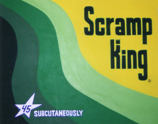
Scramp King, my first painting, which I painted in late December 1994.


Back then, I was a senior-year English major who wrote poetry and considering a career as an English teacher. Despite my stated ambitions, I found myself spending countless hours in the art section of my school’s library, transfixed by one art history book after another.

One title stood out: Andy Warhol: A Retrospective. I couldn’t put that book down! I had fallen in love with Warhol’s early advertising paintings — of household appliances of vacuums, drills, and refrigerators depicted in newspaper ads. In these seemingly unfinished portraits on canvas, everyday products were exalted.

Before returning home for Christmas break, I took out a loan for the Warhol retrospective catalog. I consulted that book continuously throughout vacation, each time feeling emboldened to start my own journey as a painter.

One night following Christmas, I took the plunge into making art. With images of Warhol’s paintings and a painting idea of my own glowing in my brain, I wandered into my mom’s art studio, tore the shrinkwrap from a pre-stretched canvas, grabbed some tubes of acrylic paint and a brush, and embarked upon realizing an idea for a painting that I had carried with me for more than a year: the wrapper of a 3M Scotch Brite sponge. Thing is, this new painting wouldn’t say Scotch Brite. I wanted it to say Scramp King! This was to be a portrait of a product that could exist only in a parallel universe!

scotch brite scouring pad by 3m
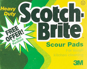
In the mid-1990s, Scotch Brite scouring sponges looked something like this. A wrapper that looked similar to this provided the source of inspiration for Scramp King.


Where did Scramp King come from? In the summer of 1993, I worked as a groundskeeper at an apartment complex. One project was to wash tenants’ front doors with Scotch Brite scouring sponges. (Man, were they abrasive! I scratched the heck out of quite a few doors!) In the process of removing dirt (and paint), the word “scramp king” jumped from a sponge’s wrapper into my brain, after I misread the packaging out of the corner of my eye.

That first painting seemed like such a transgressive act. It wasn’t the subject matter that was transgressive. It’s that I was a literature major who had never taken a studio art class — just a few art history classes. To me, painting is what studio art majors did! I felt like I wasn’t supposed to be painting. And yet, there I was, painting (straight out of tubes!) and working my way through a painting. I was taking a step toward becoming who I am.

Back at school, my friends told me they actually thought my painting was cool, and encouraged me to keep painting. Slowly, over time, I did just that. My confidence grew. But I never did take a studio art class. (Perhaps it shows!)

Reflecting upon what I have learned over the past two decades, a few lessons stand out. If I could go back in time and give myself advice, I’d probably tell myself the following five things:

1. If you want to make art, then make art! It’s that simple! You don’t need anyone’s permission or approval. Just make.

2. Never allow anyone talk you out of giving yourself to your art. I can’t tell you how important learning this lesson has been. People very close to me tried to convince me that devoting myself to my art was a kind of a selfish waste of time, that I’d struggle financially if I were to devote my life to making art. I was told I’d never make a living at it, and I’d be better off focusing on a career that made money. Unfortunately, at pivotal times, I listened to these people. But guess what? They were all wrong! The naysayers could never understand the bliss of having a great idea for a new painting, then finding a path to realizing it.

3. Take your work seriously, but don’t take yourself too seriously. Creative successes may come along — especially when you least expect them — and your visual agenda might be validated by a curator, gallery owner, or collector now and then. It’s nice to be recognized. But whatever happens, don’t believe your own hype! Stay humble. You’re only as good as your next painting.

4. Make art for yourself. For me, the true test of a work is whether I’m able to live with it on a daily basis. That said, making art with other people in mind doesn’t work for me. The applause or indifference of others is irrelevant. And don’t hope for others to like your work. If comrades or critics don’t like something you make, so be it. When you make art for yourself, the conversation surrounding the finished work is a separate matter. If something good happens, it’s bonus-round material.

5. Don’t compare yourself to other artists. And don’t compare your situation to that of other artists. As Theodore Roosevelt wrote, “Comparison is the thief of joy.” We sometimes read about artists who have ascended to international fame and fortune, or sell their work for ridiculous sums. Don’t let their success discount your self-opinion. Just because another artist seems to be “successful,” that doesn’t mean you can’t be, too. Keep believing in your gift. When in doubt, revisit point #4 above.

But ultimately, when I look back on 20 years of painting, I feel gratitude. I am grateful for having had the time, space, and gift of health to be able to make what I’ve made. I am grateful to my mom for allowing me to “borrow” her art supplies during Christmas break 1994, and to my sister who taught me how to mix paint. I am grateful to all of the fellow artists, friends, loved ones, collectors, and curators who have believed in my talent, and have supported me over time.

Being an artist can be a crazy calling to have. But I wouldn’t trade it for anything. Here’s to 20 more years!

— Grant Wiggins


The Story Behind My New Painting, ‘Stop Static (Before It Stops You)’

March 9th, 2014 | No Comments

What could the conveyance of visual energy, a magpie sampling aesthetic, and reclaimed stretcher bars possibly have in common? These are all things I have been thinking about as I have produced my newest painting, Stop Static (Before It Stops You).

grant wiggins - stop static before it stops you
Stop Static (Before It Stops You). Acrylic on canvas. 30 by 24 inches (76 x 61 centimeters). Commenced on the afternoon of Tuesday, February 25, 2014. Deemed complete on the afternoon of Saturday, March 8, 2014.


The primary inspiration — my starting point — for this painting is a simple box of Bounce fabric softener, an everyday object with a design that has captured my imagination for years. I love Bounce’s logotype, especially its double outlines and undulating, interlocking shapes. You may note how the lower left curve in the logotype’s “B” forms the striped motif in the upper right quadrant of the composition. What’s more, the fluorescent orange halftone pattern in the painting echoes the halftone on the box, shown below.

bounce fabric softener
A box of Bounce: What started everything for this painting.


In honor of the inspiration for this painting, I originally considered naming this piece Bounce Rate. This title could have been a nod to my experience in web content consulting. “Bounce rate” is a metric of web visitors who leave a site within five seconds of arriving; they “bounce,” in effect. Yet, I wanted to push this idea further, so I searched for figures of speech involving the word “bounce.” While that proved fruitless, I soon stumbled upon a Bounce fabric softener ad campaign from the 1990s, which had the memorable tagline “Bounce Stops Static Before Static Stops You.”

Conveying visual energy

Considering this tagline at length, and reflecting further upon what this painting represents to me, I adjusted the painting’s title again, to Stop Static (Before It Stops You). The reworked phrase sounds more like a suggestion — to keep oneself from staying still, and continue to move forward, to keep growing. The painting can serve as a visual reminder to avoid falling into ruts in day-to-day life.

I found that the new title had much in common with a central idea that I have been developing about my paintings, as a whole — that they are conveyances of visual energy. This idea came to me when one of my patrons wrote to me about some of my framed prints, which he displays in his office:

Every day [the prints] inspire me to try to pretend to be the kind of person who approaches the world with the energy and color jumping out of those little squares.

What immediately struck me about this sentence is the word energy. This is what my paintings are all about! The experience of feeling energy is what I want my paintings — especially my maximal paintings — to embody. Energy is what I want to convey through my work.

A sampling aesthetic: Merging my favorite graphical motifs

Without question, this painting is very much an homage to — and an energetic collision involving — graphical elements that fascinate me.

In addition to Bounce-inspired stripes and a classic halftone pattern (I have always loved halftones, and can never get enough of them), Stop Static also incorporates a heraldic vair ancient pattern (found in the upper left corner of the painting), and stripes of decreasing widths (another favorite motif).

Yet, the “star” graphical element is a rising diamond pattern — called “diamond haze,” I believe — by Diane von Furstenberg. For years I have admired this pattern, and have wanted to incorporate it into a composition.

von Furstenberg’s current exhibition at the Wilshire May Company Building in Los Angeles, The Journey of a Dress, has offered a perfect occasion to do so. The diamond haze pattern can be found on many of von Furstenberg’s signature wrap dresses. It also adds a visual rhythm to the walls and the floors of the exhibition. This is a classic and timeless pattern. It’s so perfect that I wish I had developed it myself. Bringing it into my work — much like sampling in music — is a way of paying tribute.

Although this painting is very much an amalgam of my favorite things, in terms of graphic motifs, ultimately I believe that this painting asks to be seen on its own terms, free of the context I just offered. There is no narrative to be had here. There is nothing to get. This painting affords a purely visual experience — and I hope it’s an energizing one, at that.

The role of “reclaimed” stretcher bars

The stretcher bars supporting this canvas are literally more than 15 years old (from the late 1990s), and recall a time when I was first learning how to paint. The bars were originally part of a pre-stretched canvas that I acquired from a store. (I haven’t purchase pre-stretched canvas in years! So much has changed.)

The painting I attempted to make on the pre-stretched canvas never got anywhere. I abandoned it, and left it in my dad’s house, where I stored many of my early works, along with my mom’s paintings.

In attempt to clear out his house, my dad recently returned to me several half-finished canvases and untouched canvas panels. What is this?, I thought, when he handed me one canvas after another. It was so hard to look at my early work! It’s awful stuff, to be honest. I struggled mightily to paint back then, and it’s evident in my brushwork.

Back at my studio, seeing this pile of old, half-finished pieces every day was a drain on my energy. Taking the canvases off the bars and rolling them up helped clear my mind.

Left with the bare stretcher bars, I realized that I had an opportunity to start over — returning to the past, building upon the past, and being reminded of how far I’ve come in 15 years. What’s more, I could make this new painting at an out-of-pocket cost of zero, using canvas, gesso, and paint that I already had in inventory. In effect, I had nothing to lose!

In the end, it was a joy to make this painting, and I hope this enjoyment comes through in my work. There were several times along the way, as I painted this piece, when I reflected on how thankful I am to be able to paint. Painting really does give me pleasure. It’s often not easy work, at all, but the rewards are profound.


Design Inspiration: The Fire Trucks of Flughafen Stuttgart

June 22nd, 2011 | 3 Comments

I admit it: I am inspired, in a very nerdy way, by the fire trucks that zoom around Stuttgart, Germany’s international airport, Flughafen Stuttgart.

Painted from bumper to bumper in eye-piercing fluorescent red, the mammoth machines of Flughafen Stuttgart Flughafenfeuerwehr easily catch the eyes of passengers who taxi down the runway of Germany’s Swabian metropolis. These trucks are so bright, I bet they’re visible from outer space!

flughafen stuttgart flughafenfeuerwehr
Two views of engine 7. Source for top image: http://www.feuerwehr-riezlern.at/. Source for bottom image: flickr.com/photos/ackermann_juergen/.


Not only do I love the fluoro-and-white paint scheme, but I also love the minimal stripes that line the sides of these trucks. What’s more, the stripes collide on each truck’s back panel, forming an angular motif accented by the awesome Flughafen Stuttgart logo and a massive Helvetica number.

I’m envious of the talented person who developed the design for these trucks, which have me thinking I wish I would have thought of that!

Side note: The fluorescent limegreen fire trucks of the Berufsfeuerwehr Flughafen Zürich are worth checking out, too. They make me want to paint exclusively in fluorescent paint from now on.


Dietmar Winkler: Posters for MIT

August 30th, 2010 | 3 Comments

Something really cool happened at work last week. Naturally, it had nothing to do with work! A designer I work with brought in a pair of Communication Arts magazines from 1970 and 1971. Being inspired by the art of that period, I was transfixed by what I found between the covers of those volumes.

What particularly caught my attention were Dietmar Winkler’s posters for the Massachusetts Institute of Technology, dating to 1968 and 1969. His designs were so good, they had me thinking to myself, “I wish I had painted that!” The second orange poster below (the horizontal composition) especially blew my mind.

dietmar winkler posters for MIT


Robert McCall

March 1st, 2010 | No Comments

I learned today that legendary space artist Robert McCall passed away, on Friday, February 26, at the age of 90.


Robert McCall, painting a mural at a NASA center. Credit: NASA


robert mccall

To many, McCall was known as the artist who painted the poster for 2001: A Space Odyssey. Others knew him as one of the great painters of the NASA program, from the 1960s onward.

I had the pleasure of viewing McCall’s 2008 show, Imagination Unbound, at the the University of Arizona Museum of Art. I keep a copy of the promotional flier for the show on the wall of my studio, by the door. I see it practically every day, and it helps to set the tone for the art I enjoy making so much.

I have been moved by Robert McCall’s bold vision for the future, as well as his precise rendering of concepts and environments that are so challenging to imagine. What’s more, I can never get enough of looking at his work. Especially in his most imaginative works, there’s always something new to see.

Robert McCall was one of the people that made Arizona great. Knowing that he lived here, just miles away, made me feel better about living here. I am thankful that he so generously donated many of his works to the University of Arizona Museum of Art Visual Arts Archive.

Thank you for inspiring me, Robert McCall. We will miss you.

Grant Wiggins

Below: Fantasia with 23rd Century Megastructures, a 2006 painting I made that was inspired, in part, by Robert McCall.

robert mccall


Detergent boxes: Graphic inspiration

January 8th, 2010 | No Comments

detergent boxes
Image via daniele_lavamat


Over the holidays, I rediscovered my love for detergent boxes — especially vintage detergent boxes. I love how their graphic swirls and shapes are designed to arrest the eye. Beyond that, there’s something ineffably cool about the way detergent boxes have “all-over” compositions — they use all available space. Throughout this genre of design, it is as if negative space is viewed contemptuously as a waste of space!

That said, thank goodness for Flickr. And thank goodness for people like daniele_lavamat, who photograph and upload their detergent box collections (shown at left). If you haven’t seen this collection, and you like packaging, daniele_lavamat’s photostream is worth a visit. You’ll find fascinating snaps of European brands like Ariel, Dixan, and Soflan.

And there’s also IvoryTide’s photos of classic American detergent and soap brands, such as Fab, Rinso and Dash. The Rinso box below is gorgeous.

Guess I should upload photos of my detergent box collection, which represents brands like Trend and Biz. Wonder why I haven’t already. Regardless, a small part of my vintage packaging collection can be found on Flickr here.


Interlocking stripes

March 10th, 2007 | No Comments

This may not turn out to be the most charismatic blog post ever. My source of inspiration isn’t the most charismatic. But hey! Whatever.

Glenn Roeder wears a certain tie virtually every game. It’s a pretty straightforward tie, but I think it’s pretty cool. (If you’re not familiar with who Glenn Roeder is, he’s the manager of English soccer team Newcastle United.) I found this photo online to show you what I mean.

I’ve tried to mess with the tie’s pattern. I dig the interlocking stripes, so I thought I could mash them up and make them collide a bit . . . maybe even add more layers of colliding stripes for a more chaotic effect. I’ll have to file this away for future use.

In other news: Today was a glorious day in Tempe, Arizona. A high temp of 88 and not a cloud in the sky. Ideal for opening up the house and letting the breeze roll through the studio. As it gets warmer, the acrylic paint dries faster, which is a very good thing. And so I started work, officially, on Like Antique Shopping 100 Years Ago. (Sketch here.).

interlocking