I remember the first time I ever saw a painting by Julian Stanczak in person. It was at the Toledo Museum of Art, several years ago. Standing before And Then There Were Three, in all of its 4-foot-by-12-foot vastness, I literally felt myself being engulfed by the colors and forms before me. Green and red were banging against each other, forming a warm brown, vibrating against several rhythmic progressions of purples.
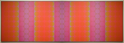
And Then There Were Three by Julian Stanczak. 48 x 144 inches (122 cm x 3.7 m). 1971. Collection of Toledo Museum of Art. Photo by Faasdant via flickr.
I remember trying to focus on just one color — training my eyes to carefully scan the canvas from bottom to top edge, in a vertical line — and noted how my perception of that singular color changed, based on its proximity to other colors.
The more I gazed at And Then There Were Three, the more I fell into it, as if a gravitational pull had lured me into a radically different (and far more interesting) reality. I couldn’t pull myself away. I was in bliss.
That moment at Toledo Museum of Art changed my thinking about art and how I saw my own art. Julian Stanczak had joined my personal constellation of art superstars.
Ever since, I have followed the arc of Stanczak’s career with great interest. I have enjoyed the resurgence in interest in his work — as evidenced by his inclusion in the Optic Nerve, presented by Columbus Museum of Art in 2009, as well as CLE OP: Cleveland Op Art Pioneers, on view through February 26, 2012 at Cleveland Museum of Art.
The fact that Stanczak is a Clevelander — he resides in Seven Hills, one suburb east of where I grew up (Hint: It rhymes with “pharma.”) — who attended Cleveland Institute of Art around the time my mother did (ca. 1950), makes him even cooler.
Naturally, when Julie Karabenick, editor and curator of Geoform.net, contacted me last week to let me know that she had just posted an interview with Stanczak, I virtually flipped out. At first, I tried to read the interview on my phone, but quickly stopped once I realized how comprehensive it is.
Clocking in at more than 15,000 words (23 pages of 10-point type, without images, expertly led and transcribed by Karabenick), this interview is a definitive, tour de force window into how Stanczak sees his work, his influences, and his creative process. Read the complete interview on Geoform.net here.
“Color Meltdowns”
Several themes continually resurface throughout the interview. Stanczak’s love of color emerges early; he views color as “abstract, universal — yet personal and private in experience. It affects us emotionally, not logically as do tangible things.”
As the interview progresses, Stanczak’s insights take on a gravity not unlike Paul Klee’s near-mystical observations in The Thinking Eye, but with a playfulness and optimism shared by Verner Panton. You intimately sense Stanczak’s love for color, and his deep interest in creating a visual sensation for the viewer, through interactions between colors.
“I want to fuse many colorants and their gradations into a single color experience — a ‘color meltdown,'” he says. “I am interested in the glow of colors as they interact and intermix, as they give to each other. And there are many factors I must consider to achieve the desired meltdown.”
He speaks of his paintings as an “interactive fusion” of colors, where “visual elements lose their individuality for the sake of totality.” Stanczak’s canvases are surfaces upon which colors invite our eyes to mix them into entirely new colors, forming a “haze” or “glow” as they interact.
Nature as the greatest teacher
Unlike anything else, the natural world has challenged and inspired Stanczak to experiment with colors, forms, and its many sensations. The artist expresses an instinctual fascination with the geometry and visual rhythms that permeate life.
“More than any of my teachers, Nature directed me, and I gained more conviction through, for example, observing water reflections, river currents, wood grain or grasses swaying,” Stanczak says. “In many of my studies the rhythmic use of line or shape refers to weather and light.”
During his early teaching career in Cincinnati and Cleveland, in the late 1950s and early 1960s — a time of great isolation for the artist — nature was Stanczak’s one constant.
“With no one to promote my clean geometry, whom could I turn to for some kind of confirmation? — to Nature, as always,” he observes. “I have always felt that Nature harbors the answers to all my questions.”
Josef Albers
Stanczak’s recollections of Josef Albers, one of his professors at Yale, form a particularly fascinating section of Karabenick’s interview. The artist remembers:
At Yale one of the first lessons I heard from Albers was, “I cannot teach you your art!” Albers used destruction as a method of construction in his teaching. Anything you thought you knew was taken away. The principle was not to get attached to anything too early, but to keep looking, searching, and thinking. Albers made endless demands for you to be better, to be a more observant participant in life. You experienced total emancipation from what to do, how to do it and what to think.
[Albers] gave me the courage to explore color beyond the classroom. He gave me the mindset to accept questions as part of life’s energy. My paintings and my search for understanding of color were based on a step-by-step process of observation. My observations might not match those of another person, but they became my foundation to build upon. I was gratified that Albers chose to include one of my pieces in his Interaction of Color portfolio.
Albers emerges later in the interview, when Stanczak drove to New Haven to invite Albers to the opening of his first solo show in a New York gallery — Julian Stanczak: Optical Paintings, at Martha Jackson Gallery in 1964. The exhibition’s title unnerved Stanczak, but particularly rankled Albers.
Stanczak remembers:
I found him aroused, pointing to the exhibition announcement in the paper. Without a greeting he said, ‘Your obligation is to correct that!’ I asked him what term he would use to describe the work, and he said ‘Perceptual painting.’ He was imperative about my responsibility to take action against something like this. I tried, but the term had already entered the public domain.
Stanczak viewed his paintings as an opportunity for “perceptual experience,” not purely optical experience. The latter was, in his opinion, a matter of merely “registering visual actions blindly.” Pattern and illusion — eye-attacking art-making tactics, on their own — never motivated Stanczak the way they did so many of his contemporaries.
Reading Karabenick’s interview is like a walk through time, spanning Stanczak’s life and the art currents surrounding and shaping him. The interview offers remarkable insights into one an artist’s lifelong approach toward color, form, and his highly individualistic art-making process — which undoubtedly has involved many miles of tape.
I consider this interview a gift that will continue to unfold new meanings as I re-read and reflect upon it, in a way very similar to seeing Stanczak’s paintings in person, up close. It is a master class that any artist can attend, and I am thankful for the opportunity to have experienced it.