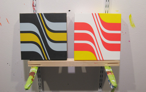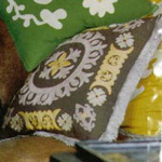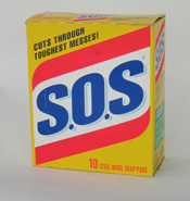
Two of my newest paintings from the Motus series: Motus 006 (Suzani) and Motus 005 (Steel Wool). I based the former on a vintage box of SOS pads (See Fans of Vintage Packaging, Rejoice!), while the latter is a riff of a pillow from Anthropologie (below).


Top: The Anthropologie pillow that inspired the colors of Motus 006. Above: Vintage SOS, the inspiration for Motus 005
When it comes to art, color combinations can spring from anywhere. I enjoy interior design colors because they are typically colors that most people enjoy living with. (Go figure!) When I mix paints to match color combinations found in interior design magazines, I typically go in the opposite direction of what I gravitate toward.
(I’d live in a fluorescent orange house with fluorescent orange windows if I could! Or perhaps just one room would be that way.)
For Motus 006 — the aforementioned painting inspired by the Anthropologie pillow — I added 2 parts gray and 2 parts light blue to 10 parts titanium white; the mustard color is hansa yellow with a couple of drops of burnt sienna, a touch of mars black and lots of titanium white.
These art color combinations is very muted in a surprisingly wonderful way. These are interior design colors I normally wouldn’t mix. But I’m very happy with the outcome.
The Steel Wool piece uses the bold colors of packaging design: yellow, fluorescent red and white. It’s an eye irritant. I find inspiration in packaging and race cars for that reason. They’re all about grabbing your attention. Fluorescent colors are an easy choice. A race car is much easier to spot from a mile away when painted fluorescent orange.
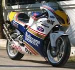
The next piece in the Motus series will feature the classic navy, red, and gold scheme made famous by Rothmans cigarettes — and the beautiful paint schemes on race cars and motorbikes that Rothmans sponsored for years.
However, all things considered, interior design colors have a subtlety and gravity that racing and detergent box colors aren’t designed to employ. So I’m thinking about producing more interior design-inspired work in the future. Growing my palette a bit.
And now for something completely different, some random cool things for your consideration:
My friend Robert Bell has produced a completely boring video involving a pay phone, titled Rainy Day Interesting Video. You’ll find it to be the most interesting boring video you’ve ever seen. (Or perhaps it’s the most interesting video about boringness. Or maybe it’s the most boring video that might actually interest you?)
An entirely mad gallery of mad Russian beer coasters. The site’s in Russian, which is all the madder to an English speaker like me!
I have another friend who’s friends with one of the new American Gladiators. How utterly tough is that?
And on that note, I feel like 2008 is off to a good start. Got some good painting in last weekend. And I have a few ideas for more pieces. Lookin’ forward to what’s ahead.
Tags: color combinations


