Moments ago I finished a set of preliminary sketches for Spencer Hibert’s much-anticipated Cream art gallery / video arcade / coffee shop / vegan donut emporium. Spencer is looking for something that he calls Aztec Atari.
With those two concepts to guide me, I produced the following set of sketches. The colors are fairly arbitrary and don’t really matter at this point; they can be changed in infinite ways. I view the process of choosing colors as a separate project anyway.
Regardless, whatever doesn’t wind up in the mural will probably land in a painting, or two, or 14 … who knows! It’s not the end result I’m concerned about, it’s the process … and I’ve had a lot of fun making these. I found the project very challenging.
Grant’s note of 16 June 09:
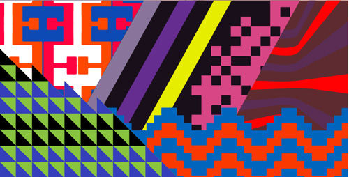
I just tended to version 2 by employing Spencer’s guidance (see comments). The first image shown below represents my interpretation of his guidance (version 2a). Below that, I decided to shake up the colors a bit, just to push the idea further (version 2b). Enough versions already, right?
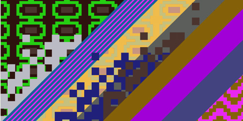
 Version 2a |
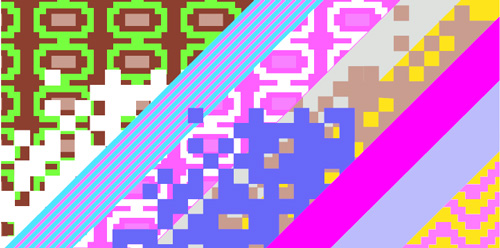
 Version 2b |
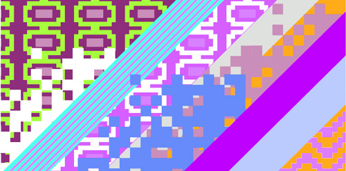
 Version 2c |
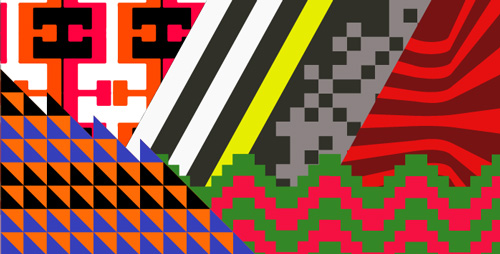
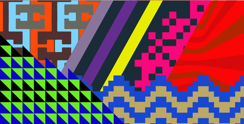
Anyway, here are the original 7 sketches:
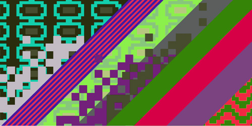
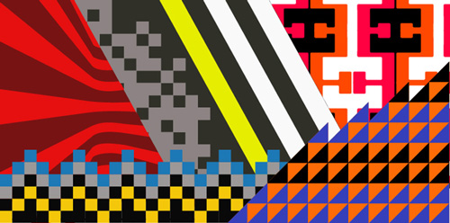 Version 2 |
 Version 1a |
 Version 1b |
 Version 1c |
 Version 1d |
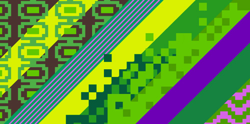 Version 1e |
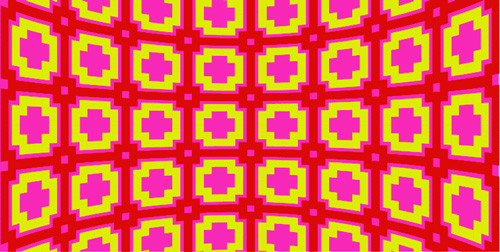 Version 3 |
Do you, fair reader, have a favorite? Your insight is welcome.
Now it’s break time!
Tags: maximalism, sketches, spencer hibert


I like all of these! Each one for a different reason. However, my favorite is version 2. I think it’s the two tone red design on the left that makes me feel like I’m being excepted into the painting. It’s like a Welcome mat on the front porch.
Good Job!
I vote for version 2 for the mural, as well. Really like the colors and it says ‘aztec’ more than the other ones.
I think version 3 should become a painting.
Nice Grant, Looking great…My vote is definetly v2. They are all nice but this sits at top.
v3 is really nice though…
Hey, Jem, Aimee and Oliver,
I sincerely thank you for offering your thoughts. I had a feeling about version 2, as well. You confirmed what I was thinking, and that really helps. I’m going to move v2 to the top … and you know what? It was the first one I designed, after all. Funny how that works.
Grant
Hola Grant!
Well, there all top notch, but yes I def gravitated towards Ver. 2. The way you have it layed out will work really nice with the walls meeting up in the corner. I only have 2 suggestions or ideas that would be cool to see if its not too much to ask.
1. Could you try switching out the pixels (just the design not color) in the bottom left of ver. 2 with the pixel design from version 1a in the bottom right corner (red/green). Love both of them but I feel like ver. 1a’s pixels have a bit more of an aztec-atari feel.
2. Could you show a flipped horizontally version of #2. The only reason I ask is it might work really well with the space if the burgandy/red stripes were coming out the other way.
These are just thoughts. I could be totally wrong, just need a visual. Either way, they are all amazing man, and i feel very fortunate to have your beautiful art in my space!
I like version 2 best for a mural
I love version 3!
Thanks to all o’ yall! I shall endeavor to carry out Spencer’s guidance anon.
alright! Now we’re gettin to the tough part. I’m pretty torn between 2b and 2c. They are both great… slightly leaning towards 2b at the moment. hmmm… lets see what others think?
ya, i know my spelling is atrocious. I’m a bird man, not a word man.
2b
2b
I like number 3 with a color change or number 2. I like the wavy lines on the left.
I still like V2 the best! or 2a….
I’d go with 2a but I really like version 3 It plays with your mind and pops out all 3D like. After playing some Centipede I could trip on that for hours.
Matt and I voted 2b. The color choice gives more depth to the picture.
1e is my favourite. i just found your blog…it`s so inspiring.
Cheers, Lora. I dig your blog, too!
Crazy 80’s video-game-retro design 🙂