Sometimes, inspiration can come from the unlikeliest places. On Saturday, I sketched out and started a new painting, inspired by vintage video footage of Southwest Airlines.
Please pardon the tangent while I explain myself:
I spotted the footage one month ago, on a PBS special that explores the book Good to Great, by Jim Collins. Southwest Airlines is one of the case studies in Mr. Collins’s book; Southwest is one of a few companies that transformed themselves into a great company by adopting a “hedgehog concept.” I won’t get into specifics here, because this is a blog about art, not management. (One could employ Good to Great principles to art, but I’m puzzled over how the “economic engine” part would work!)
Regardless, while Mr. Collins wasn’t waving his hands violently, or when Southwest founder Herb Kelleher wasn’t talking about greatness, the program would cut to stock footage of Southwest’s early days.
There it was — brilliant stuff spanning the 70s and early 80s: feathered hair and 3-piece beige business suits made of wool! I think of the early Southwest as Braniff for the proletariat. What the world needs now, I have decided, is a piece of vintage-themed Southwest Airlines art!
 |
 |
 |
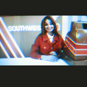
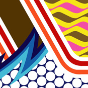
Anyway, I sketched out the frame you see at left (the low-res photo of a TV) and used it as the basis for the Southwest Airlines art sketch you see in the center.
The diagonal stripes in the background, and on the cash register, seemed very dynamic to me. And I as messed around with the composition on Saturday, I added another pattern I recently designed (upper right corner of the composition) and chose to employ my favorite color scheme of the moment: chocolate brown, yellow, and fluorescent pink.
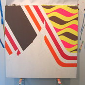
The photo on the far right demonstrates progress I’ve made to date. I’m debating on how to handle the blue lighting bolts — I think they might be better straight, like the 2002 Interstate Batteries NASCAR car.
One more thing: I realized something funny as I got further into the painting. I recalled Alexander Calder’s designs for Braniff’s airplanes, from the mid-1970s. There is an odd similarity between the brown-yellow-pink pattern and Calder’s designs. I used this pattern totally on accident, but given the link to Southwest and aviation, I have to wonder whether this was the work of the unconscious. Who knows.
Tags: in the studio


jesus man, Im really lovin your blogs. espesially this kind of stuff-
oh poop, i tried to leave in image of the airlines footage and it didnt work…