Where do I get my ideas for painting and color? Like many artists, I’m sure, I find inspiration from just about anything.
I never know what will inspire me to create my next painting — and color is often source of my inspiration.
Right now, a textbook I enjoyed as a first-year in college is inspiring me. The book is titled The Meaning of Life: Questions, Answers and Analysis, edited by Steven Sanders and David R. Cheney.
In school, the chapter titled “Nothing Matters” really resonated with me. Today, it’s the book’s cover, designed by Infield/D’Astolfo Associates. My next modern painting and color scheme are very much a tribute to this book’s jacket.
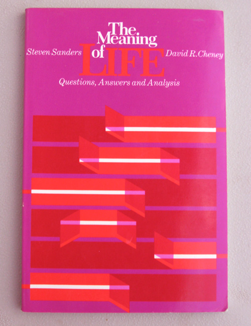
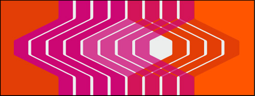
The intense clash of violet, ultrabright orange and white — and mixtures thereof — turn my eyes absolutely stark-mad crazy!
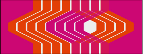
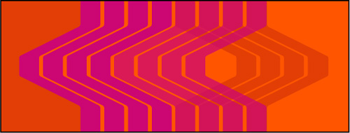
At my mixing table, I did my utmost to match paints to the cover:

Yet, as I modeled this on my computer, I found that I wasn’t thrilled with using white.
Below, the first and second images are with white The third image eschews white altogether (Leave it to Verner Panton to talk me out of using white!), offering a variant of the second design.
Of these three, do you have a favorite? Let me know in the comments below. I’d appreciate your feedback.
All of this proves that, just like the meaning of life can be anything to anyone, inspiration for painting and color can be anything to any artist.
Tags: color combinations, paintings


http://tinyurl.com/n8y4h8
Oh, and I think I like the first one best but I keep changing my mind. I kind of like it without white, too. Did you try a violet background without white?
damn…the link didn’t work. Well my point was that it brings to mind the coloring of a particular tropical fish, the name of which escapes me.
I think the way you’ve used color in the middle one feels more dimensional. There’s a unique subtlety to the bottom painting though. I think it’s darker orange on the lighter. On either of those, did you happen to try a darker/lighter violet on the left so that the background would be different on the left and right? I’m sure you love this kind of comment…
Yes, Dave. I love the kind of comment you provided. I shall try to explore the middle and bottom compositions. I’ve lost interest in the violet background approach. I think it’s time for me to start experimenting with it on canvas. Anything can happen at this point. Thanks for your perspective.